CLIENT
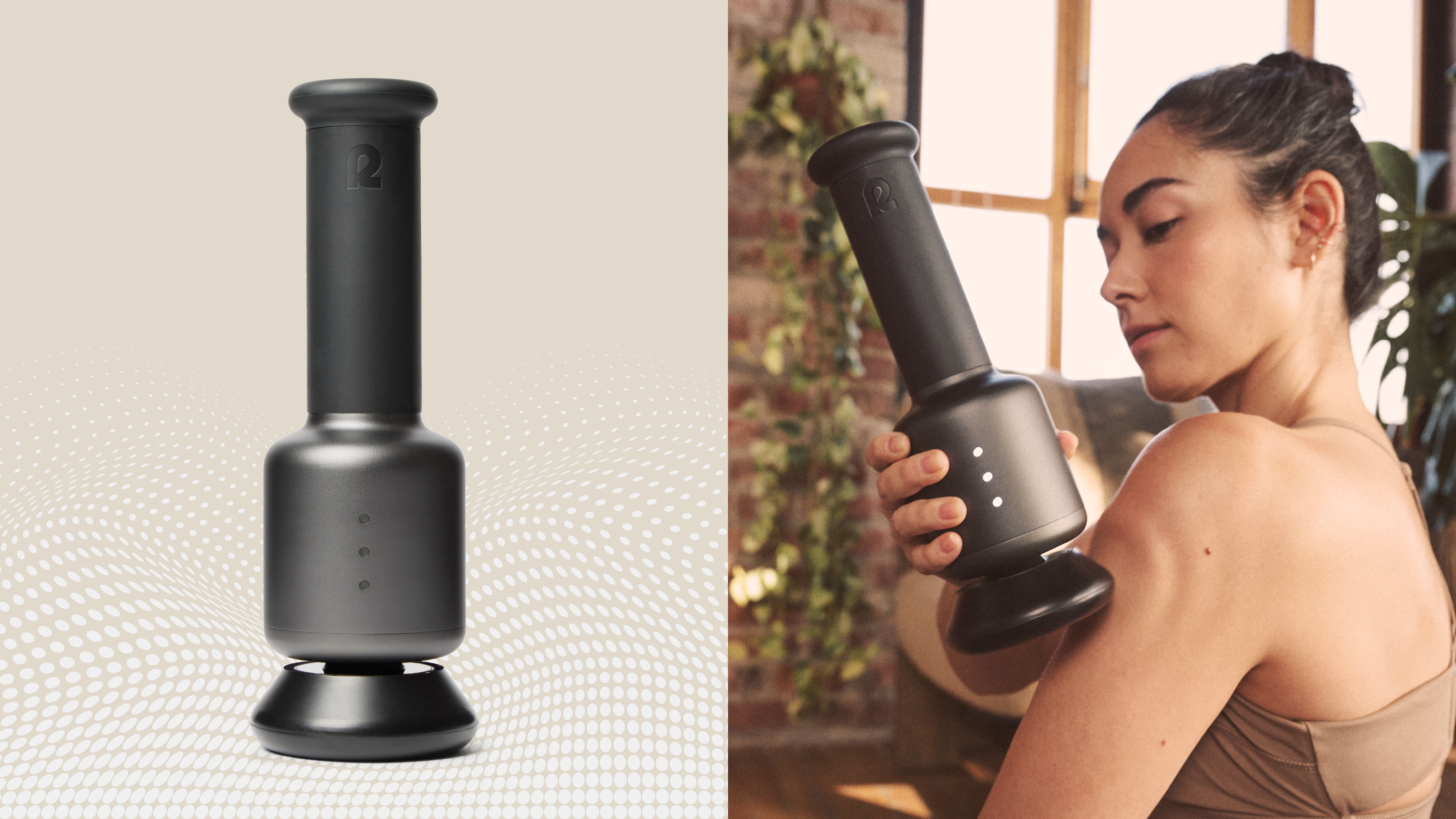
Rally Orbital Massager
Creative Direction: Dan Gladden
Design Direction: Andrew Sondheim
Design: Camille Avarella & Nile Hope
Brand Strategy: Phil Lauria & Paola Bocock
Account Lead: Jordan Coté-Long
Renders & Animation: Justin Sotille
Client: Rally & Doris Dev
Agency: Interact Brands
Services: Brand Strategy, Brand Naming, Tone of Voice, Visual Identity, Brand Starter Kit, Website Design
PROJECT
Experience the revolution, adding relief to your routine.
The recovery space wasn’t short on options, but it was short on elegance. Most tools promised power. Few delivered comfort. Rally came to us with a category-defying idea: recovery could be both effective and gentle. A tool that treats your body with care while working just as hard as you do.
Our challenge was to build a brand that matched the product’s nuance and performance. It needed to be bold enough to stand next to category giants, and refined enough to feel like a ritual, not a chore. Rally wasn’t just entering the recovery market. It was here to shift it.

Rally is positioned as the recovery tool for those who demand more from their wellness routines, resilient, refined, and focused on moving forward. Its name signals strength and revival, while the brand voice blends confident clarity with quiet elegance, mirroring the product’s balance of power and softness. Rally’s tone lives in contrast: gentle yet strong, premium yet approachable, bold yet calm. Avoiding loud claims and clutter, the language is sharp, intentional, and as thoughtfully designed as the product itself. More than a device, Rally earns its place through high-impact recovery with minimal effort, luxurious without showing off, confident without the noise.
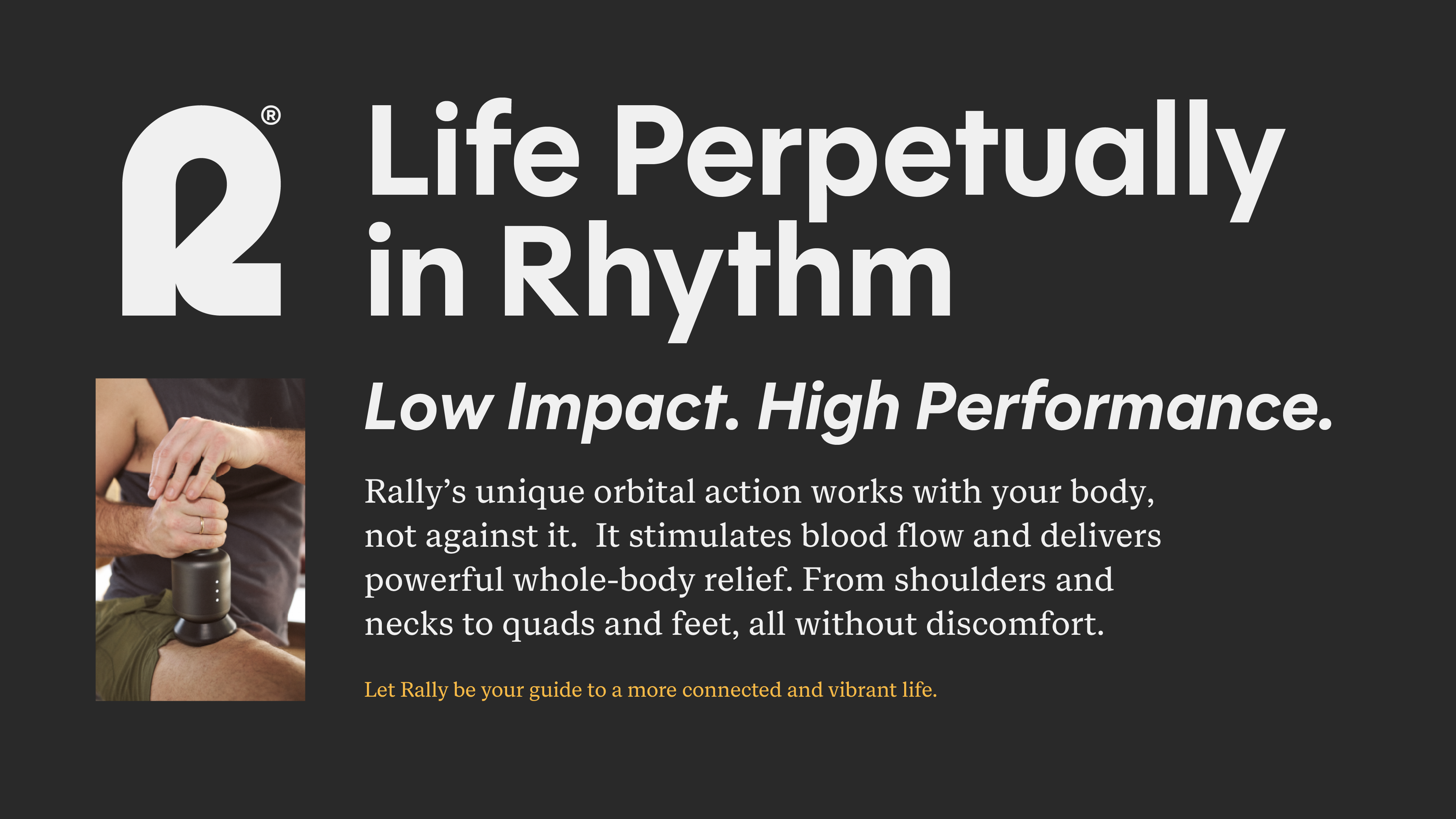
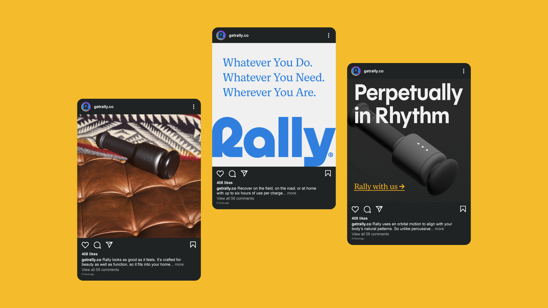
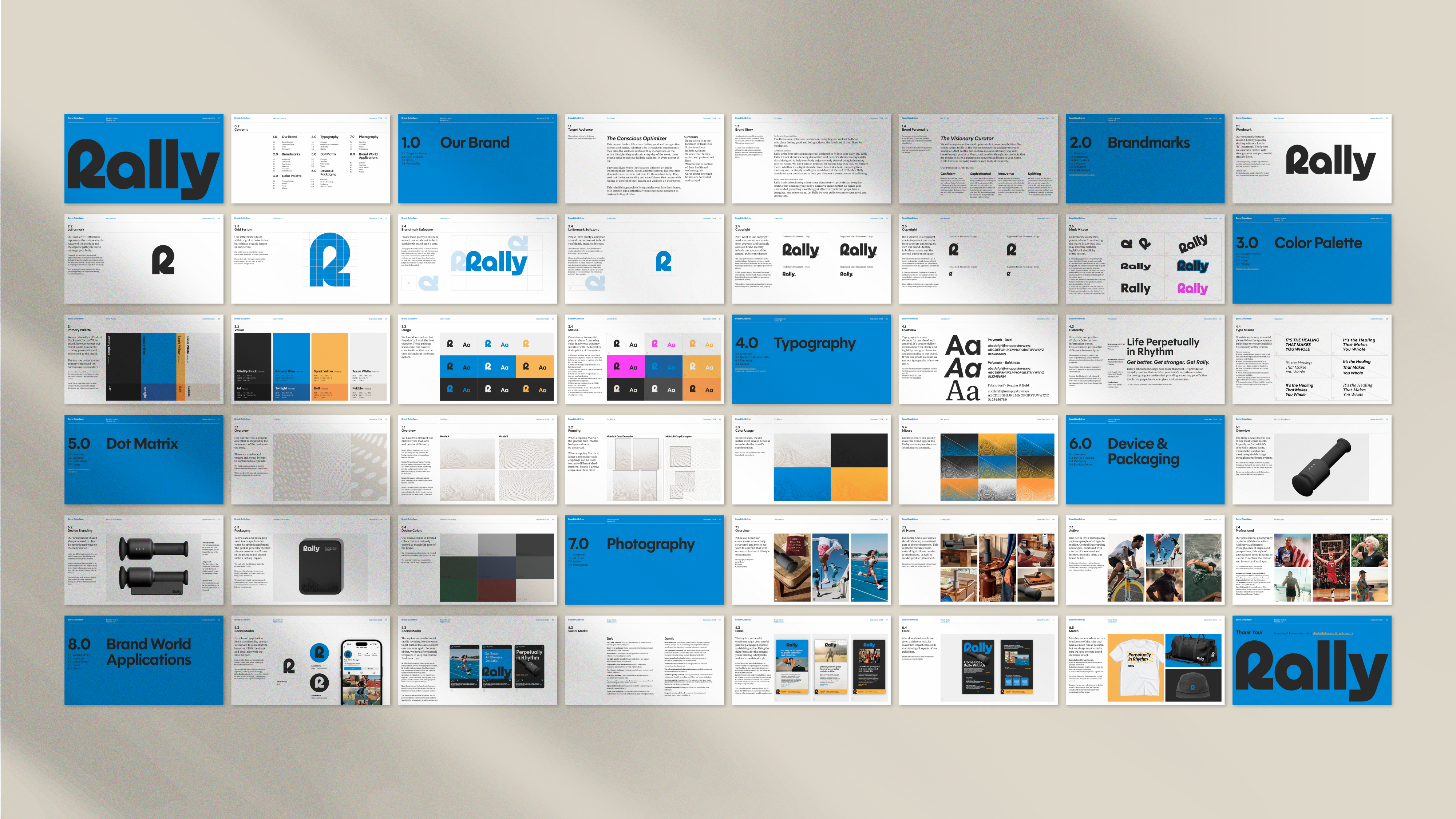
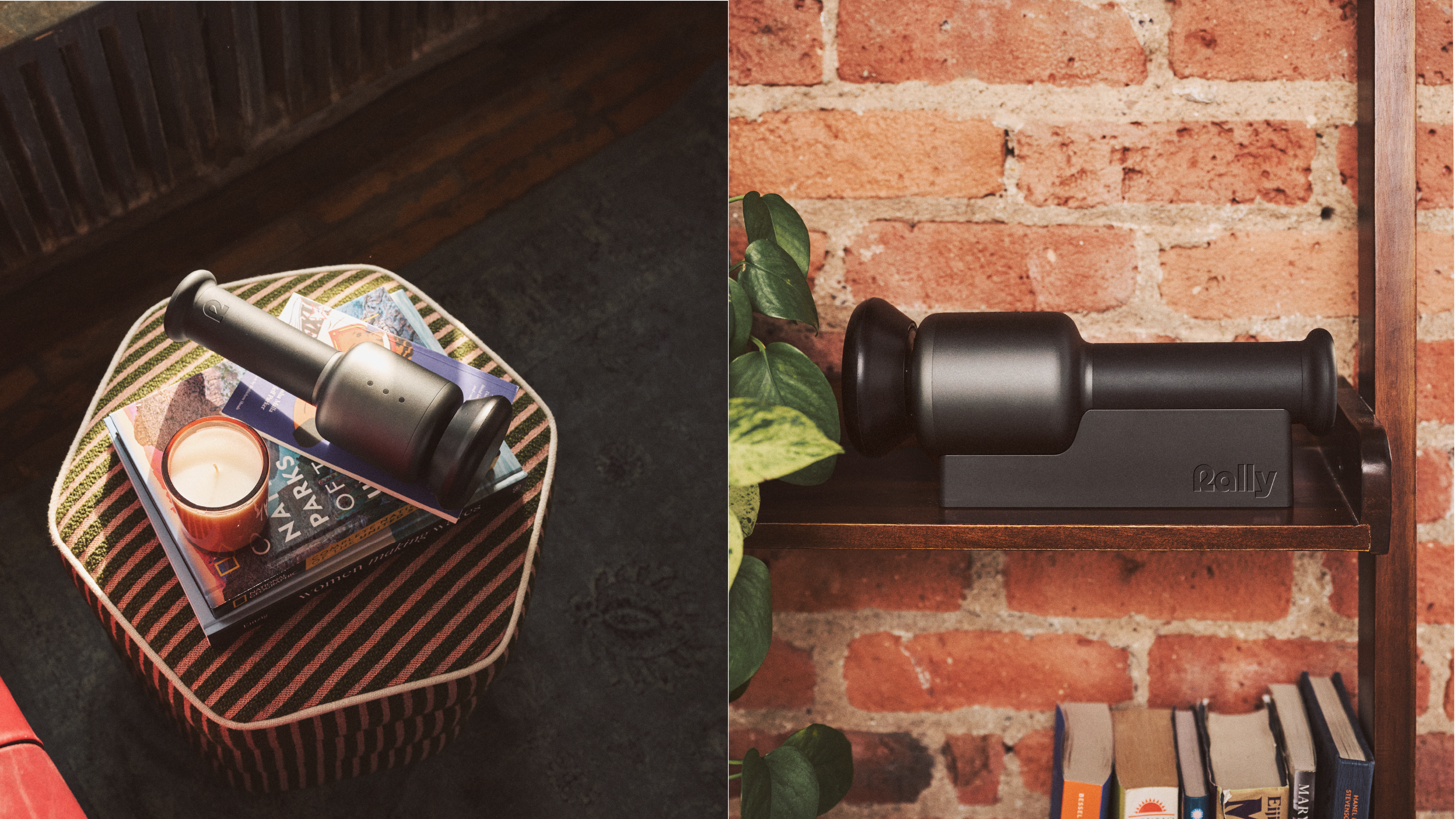
Rally’s visual identity reflects its design ethos, polished yet strong, with a deep, neutral palette that evokes performance and calm, a modern wordmark that’s confident but warm, and imagery that captures real moments of rest and recovery. Inspired by Scandinavian elegance and Japanese minimalism, Rally is crafted to seamlessly complement the home. Interact led the strategy, naming, visual identity, and tone of voice, uniting it all under the brand’s core idea, "Perpetually in Rhythm," a bold reimagining of what a modern wellness device can be.
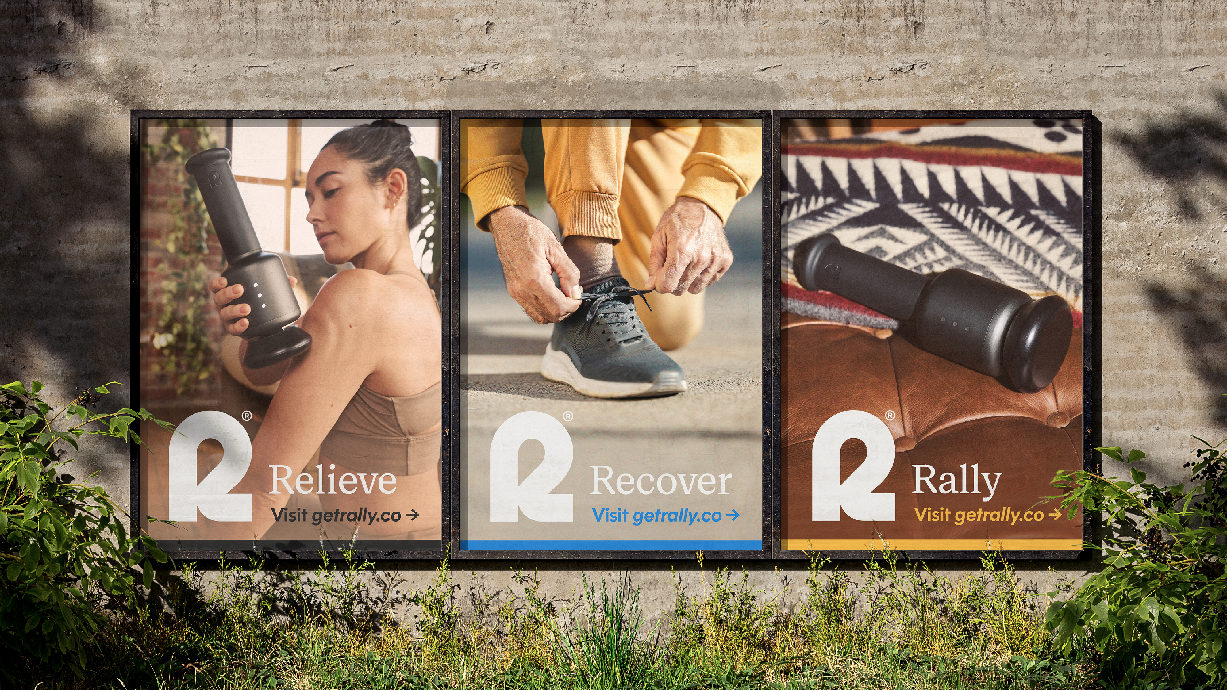
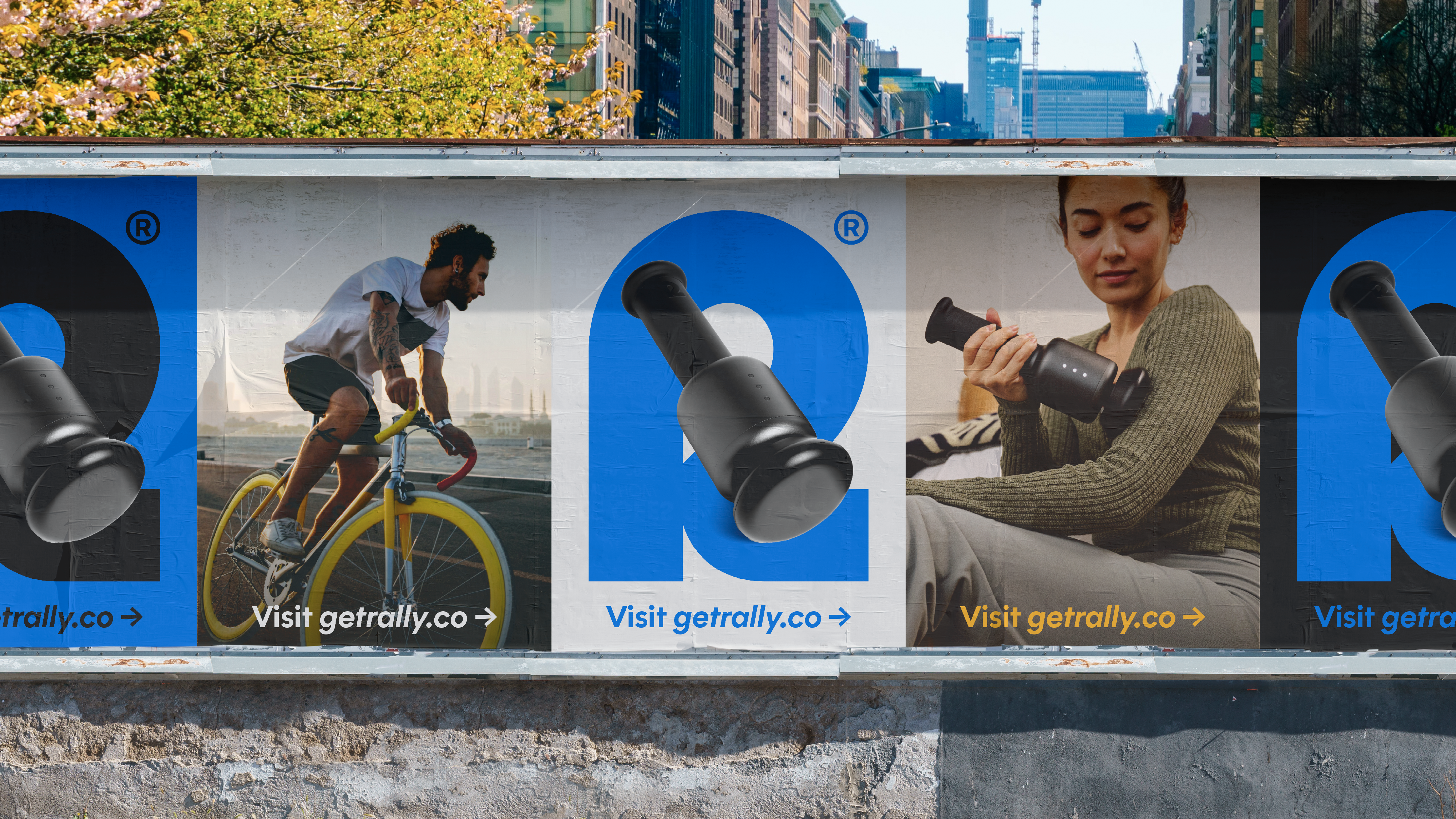

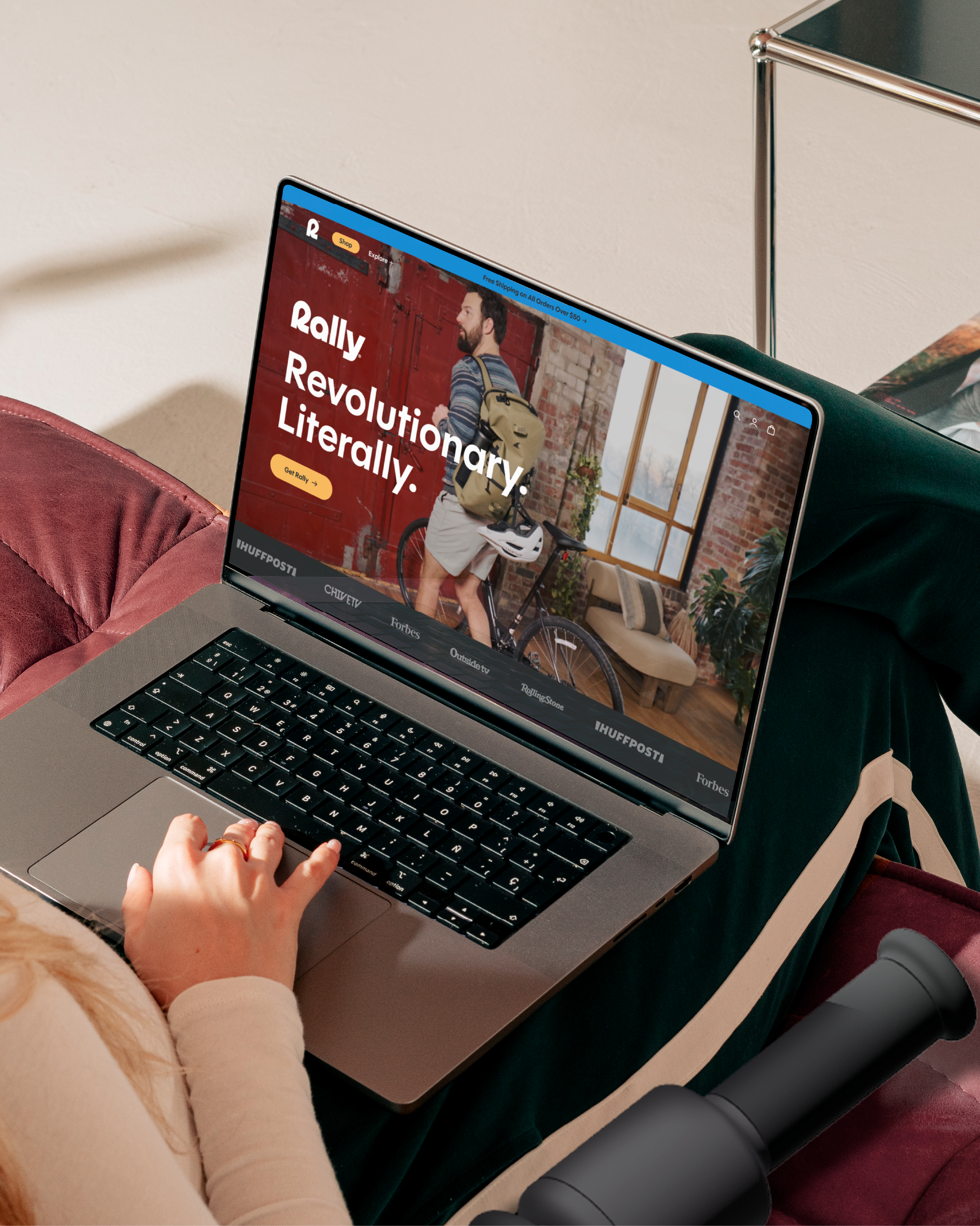
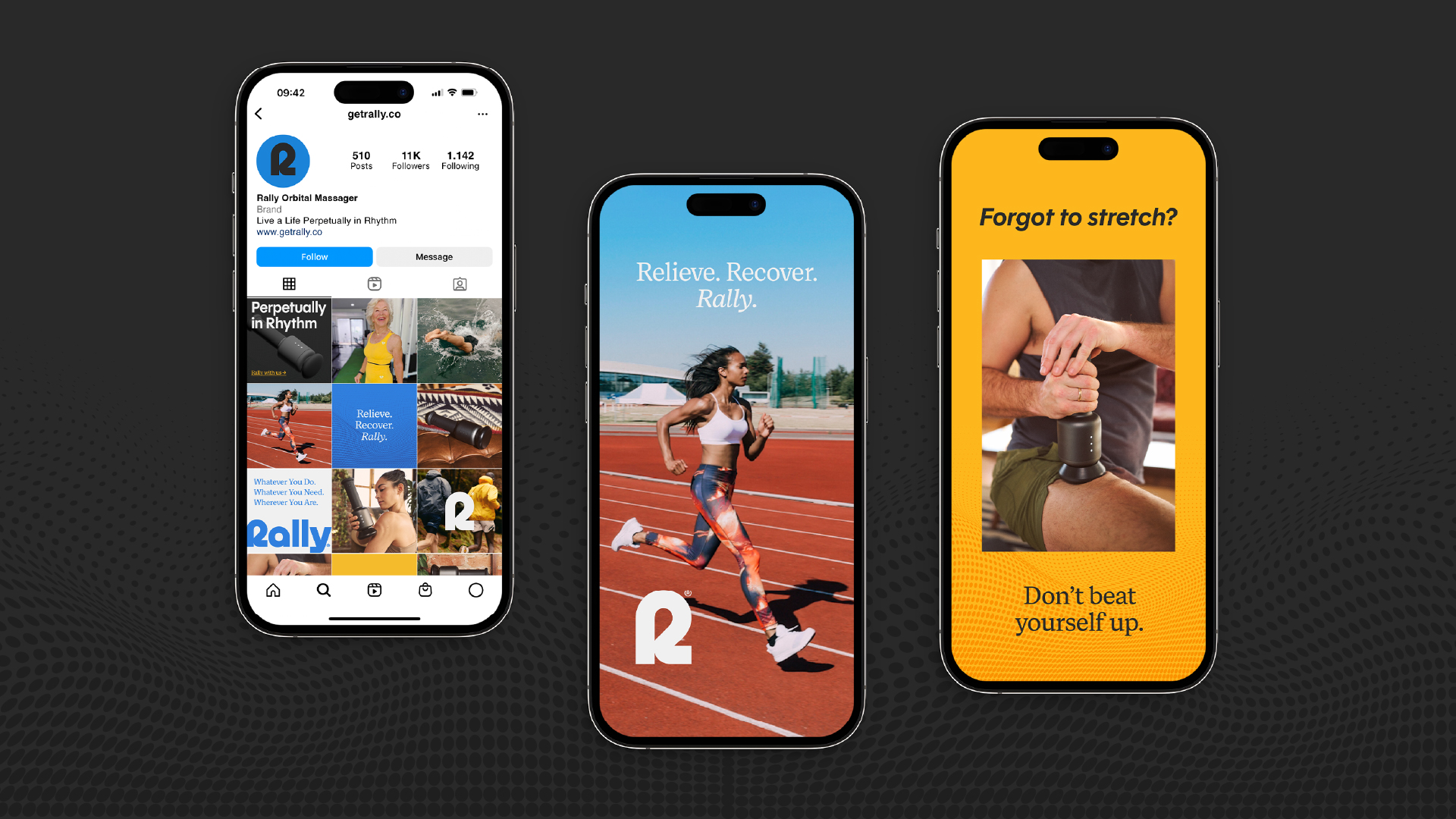
Rally’s digital presence sets the tone for launch and long-term growth. From the website to email templates, every piece of the ecosystem was designed to inform, inspire, and convert, while staying grounded in the brand’s refined aesthetic.
Rally launched not just as a product, but as a new philosophy for recovery. It offers a premium, dual-action experience that supports your body rather than overwhelming it. And with a brand built on Power & Grace, Rally is creating space in a market that was overdue for change.The product delivers results. The brand makes sure people take notice.