CLIENT
Munk Pack Brand & Packaging Evolution
Creative Direction: Andrew Sondheim & Fred Hart
Design: Lea Cawthorne & Camille Avarella
Account Lead: Patrice Resch
Typography: Simon Walker
Agency: Interact Brands
PROJECT
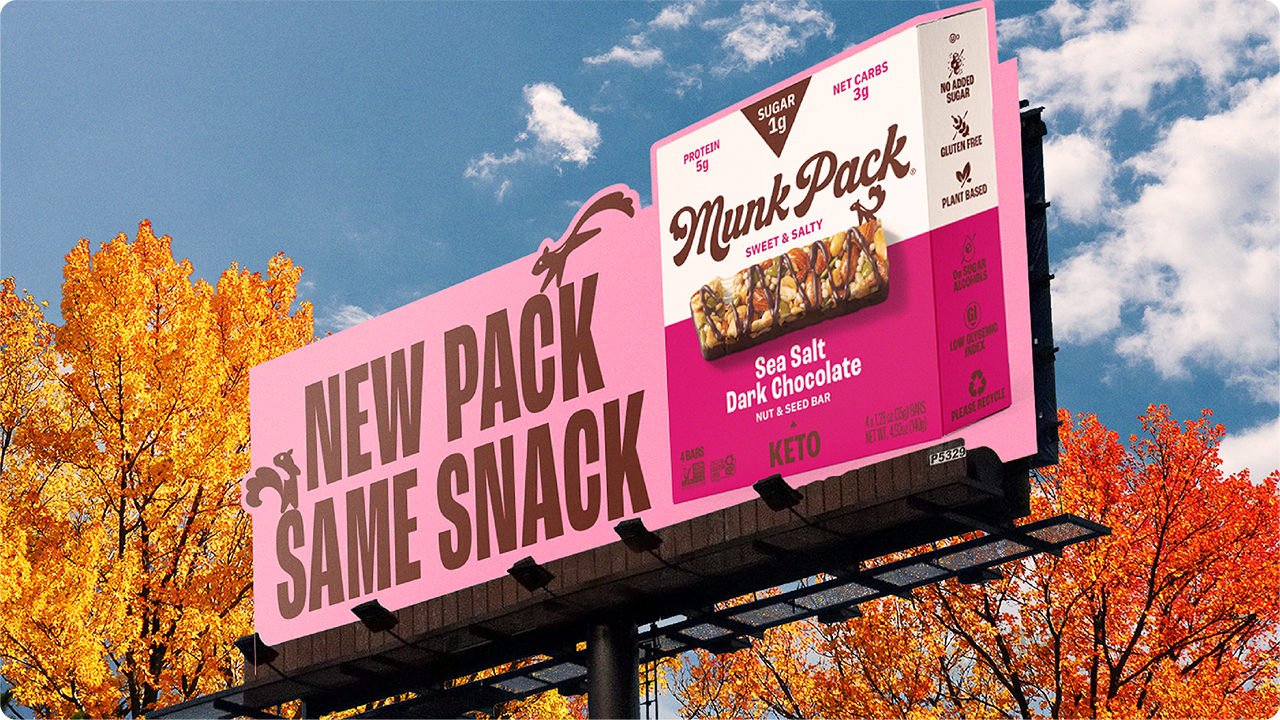
Wildly delicious evolution to beloved keto snack bars.
Munk Pack's founders pursued a low-sugar lifestyle but struggled to find satisfying snacks. They aimed to craft treats that not only tasted indulgent, like a favorite candy bar, but also avoided blood sugar spikes. While Munk Pack successfully attracted Keto consumers with their delicious bars, the brand lacked recognition. We aimed to broaden their consumer base beyond Keto and appeal to those looking for a delicious bar. New pack, same snack.

Before / After Lorem ipsum dolor sit amet, consectetur adipiscing elit. Aenean eu ipsum ut libero posuere condimentum dapibus non lacus. Aenean pellentesque dui ac venenatis dictum. Vivamus cursus metus dui, vitae feugiat nibh accumsan quis.
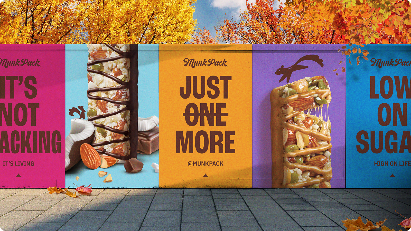
The Interact strategy team uncovered that just 5% of American consumers adhere to a ketogenic diet, while a rapidly growing 13% opt for a low-sugar diet. Notably, Munk Pack bars stand out as the lowest-sugar and lowest-carb options compared to competitors, all while delivering exceptional taste. Consumer surveys emphasized the brand's strength in clean ingredients and delicious flavor. The guiding principle of "Wildly Delicious" shaped our project, focusing on showcasing Munk Pack bars' key attributes: great taste and high-quality ingredients.
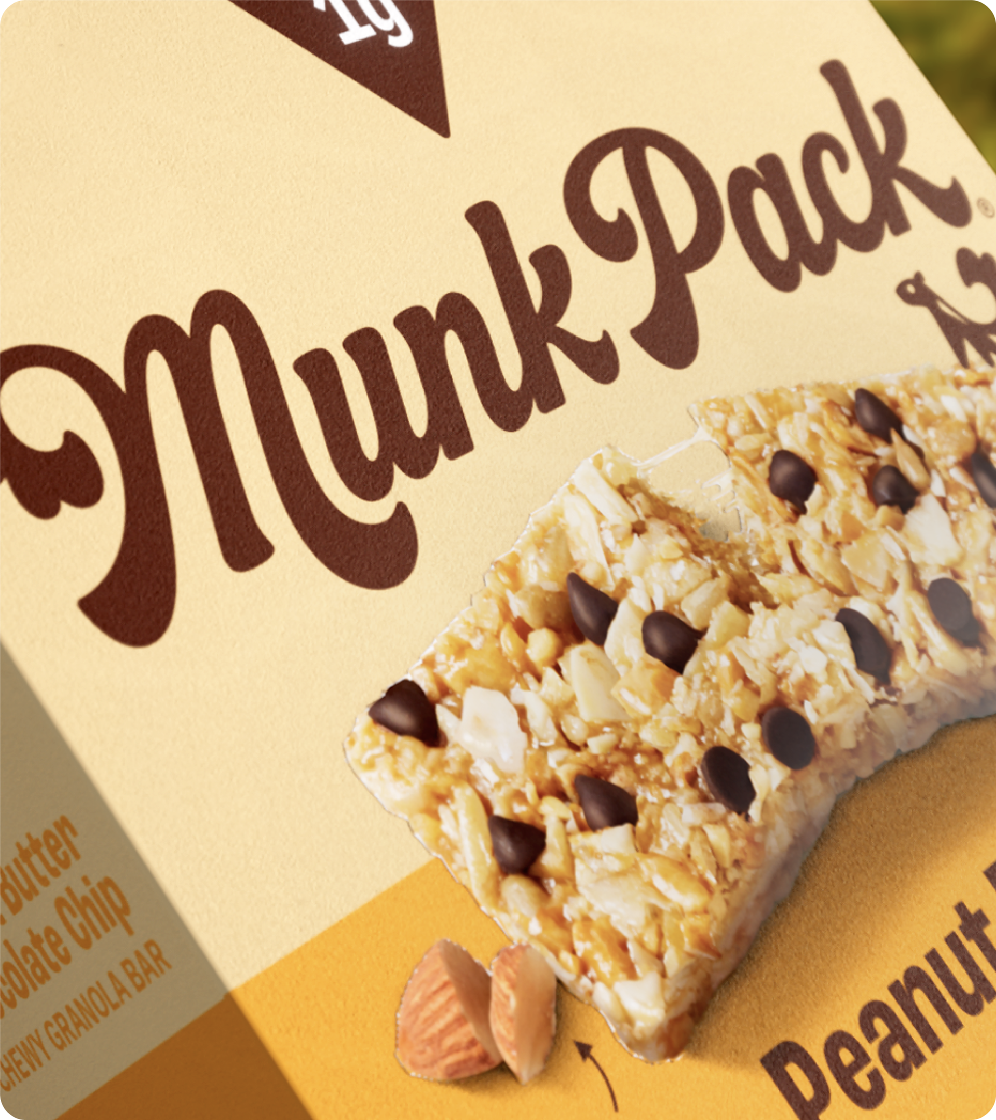

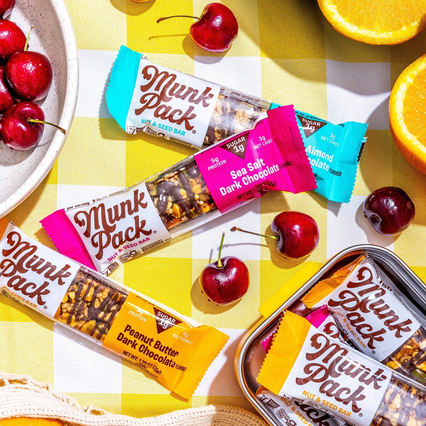
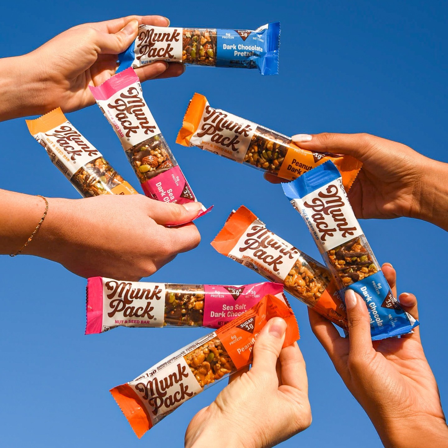
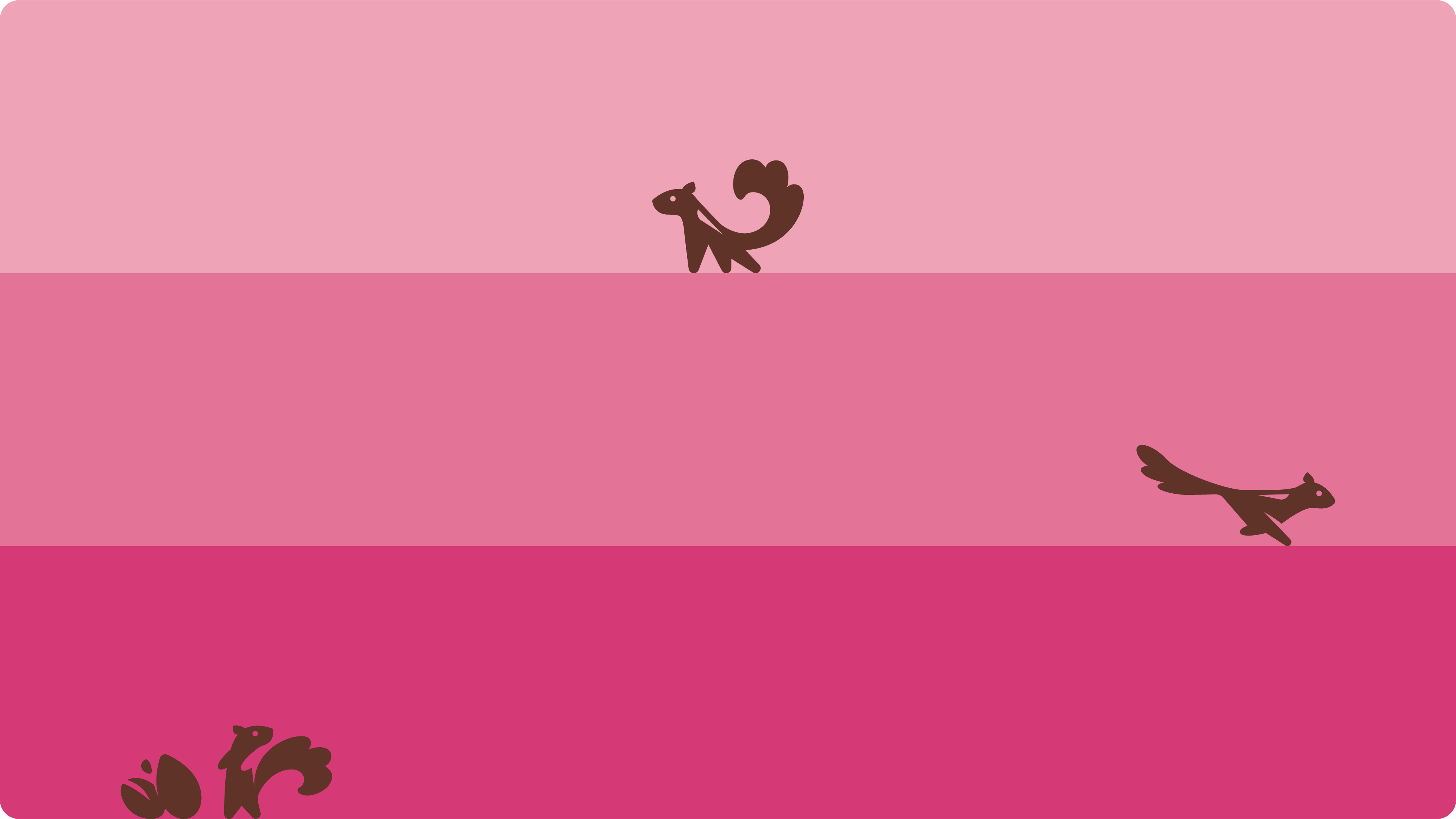
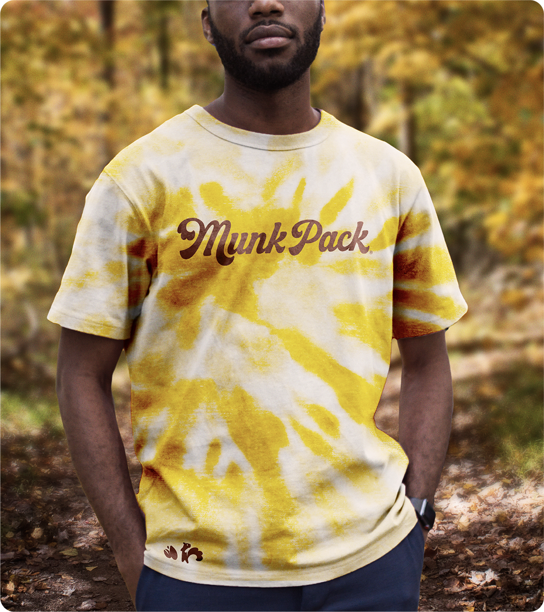
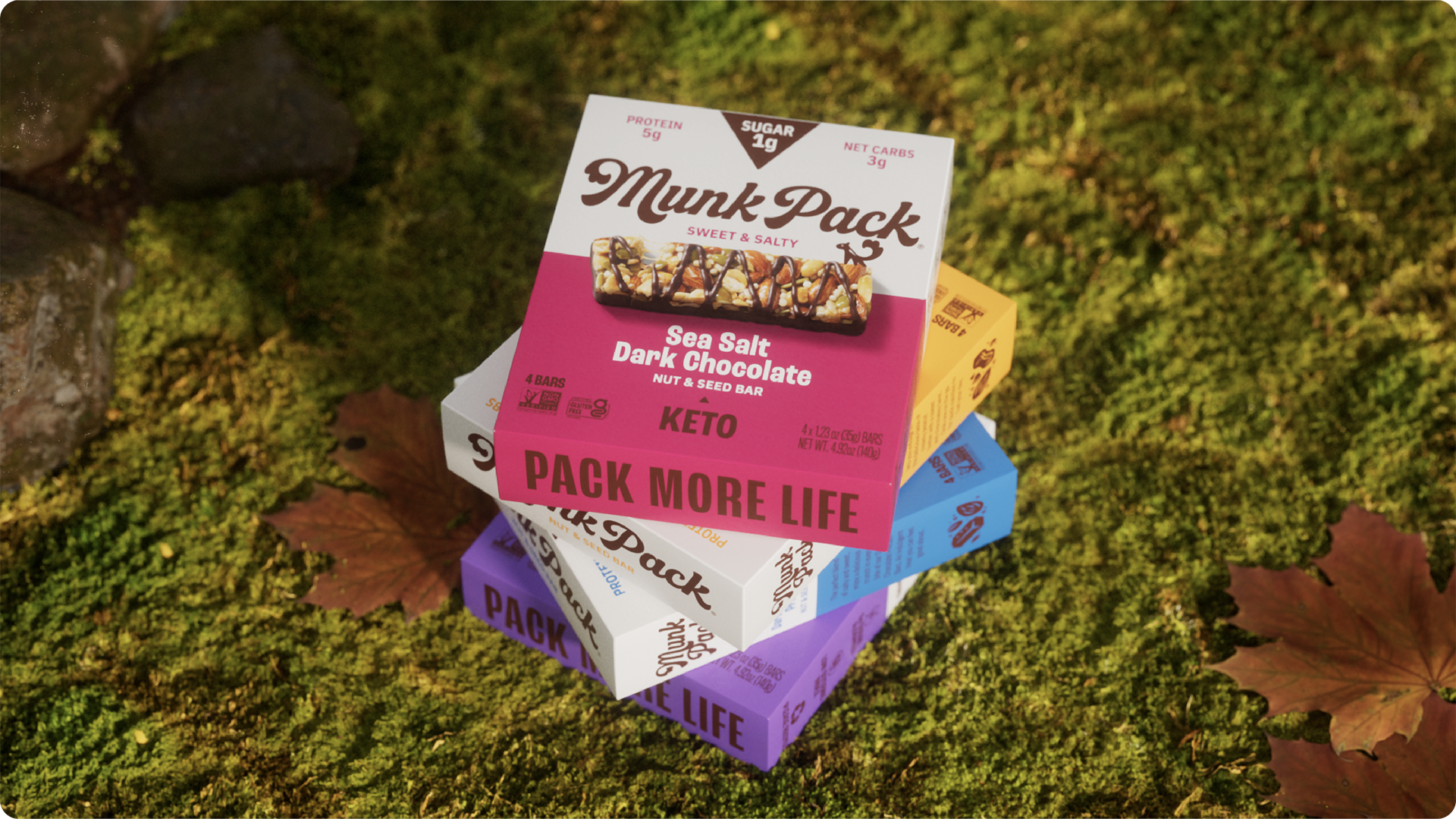
We crafted our design strategy by first identifying the need to revamp a cluttered pack design that craved more personality. Our design strategy was guided by the concept, "PACK MORE LIFE," which breathed a new life for Munk Pack. We leveraged several different design elements including a unique wordmark and a versatile and playful chipmunk icon. That said, our main objective was to reduce overall clutter to let the unique brand elements speak for themselves. These elements, in tandem with the delicious, candy-like bars, were captured through decadent product photography, ensuring our product shone brightly amidst competition. Our bright and colorful brand system brought vibrancy while championing our chief claim of low sugar, prominently featured in the iconic triangle. Our little chipmunk mascot became the embodiment of our fast-paced, on-the-go lifestyle, freely scurrying all around our packs; streamlining communication and reinforcing our secondary claims of net carbs and protein. In the end, we've not just redesigned a package, we've revolutionized the brand.