CLIENT
Rally Orbital Massager
Creative Direction: Dan Gladden
Design Direction: Andrew Sondheim
Design: Camille Avarella
Account Lead: Patrice Resch
Client: Rally & Doris Dev
Agency: Interact Brands
PROJECT
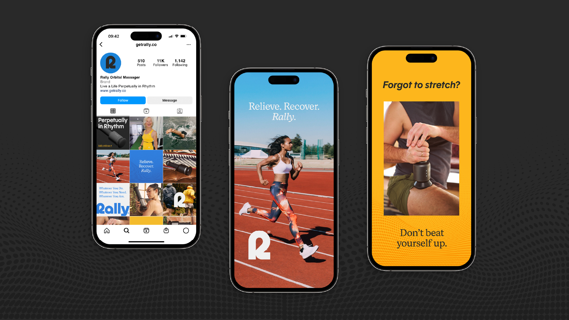
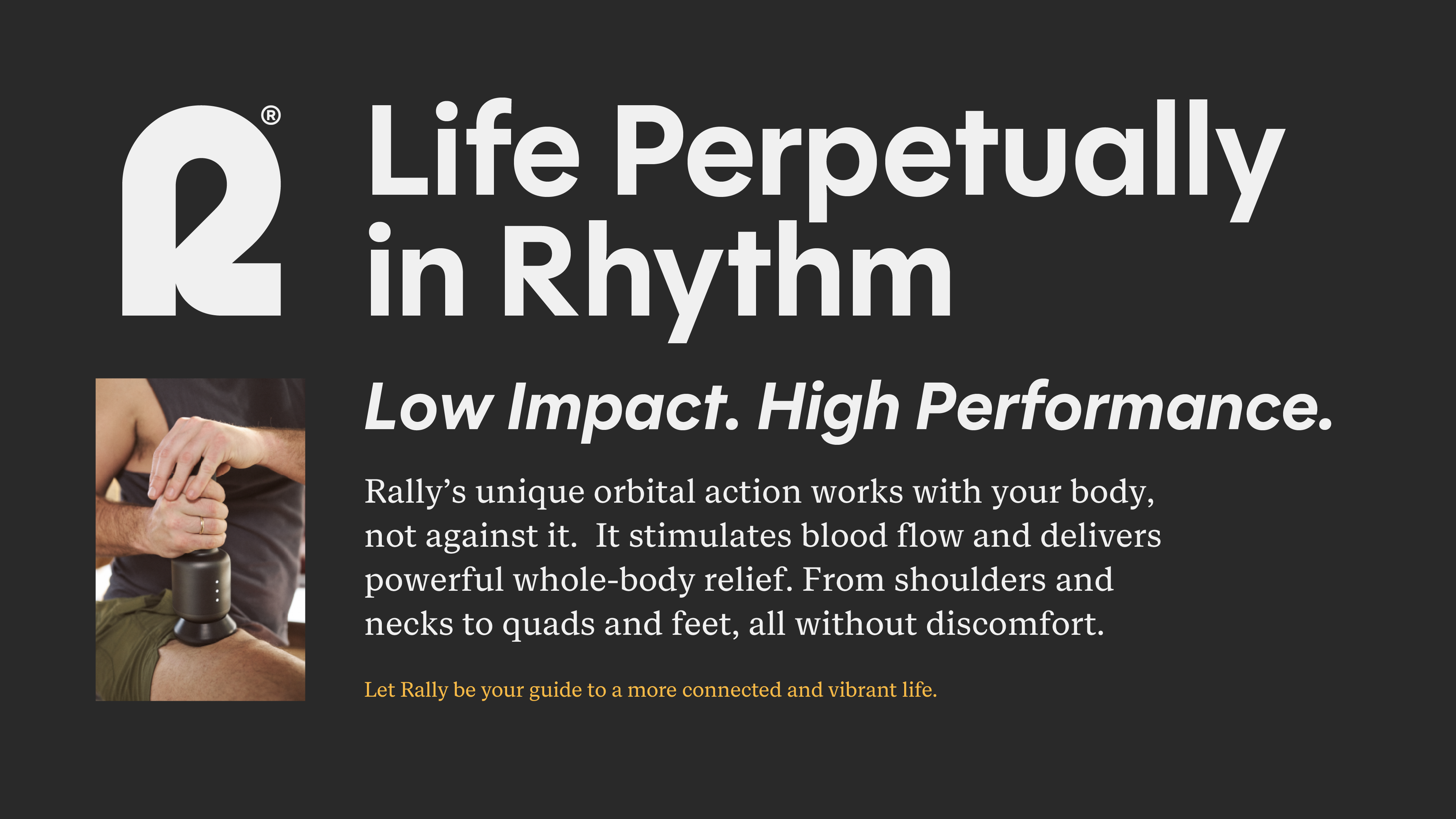
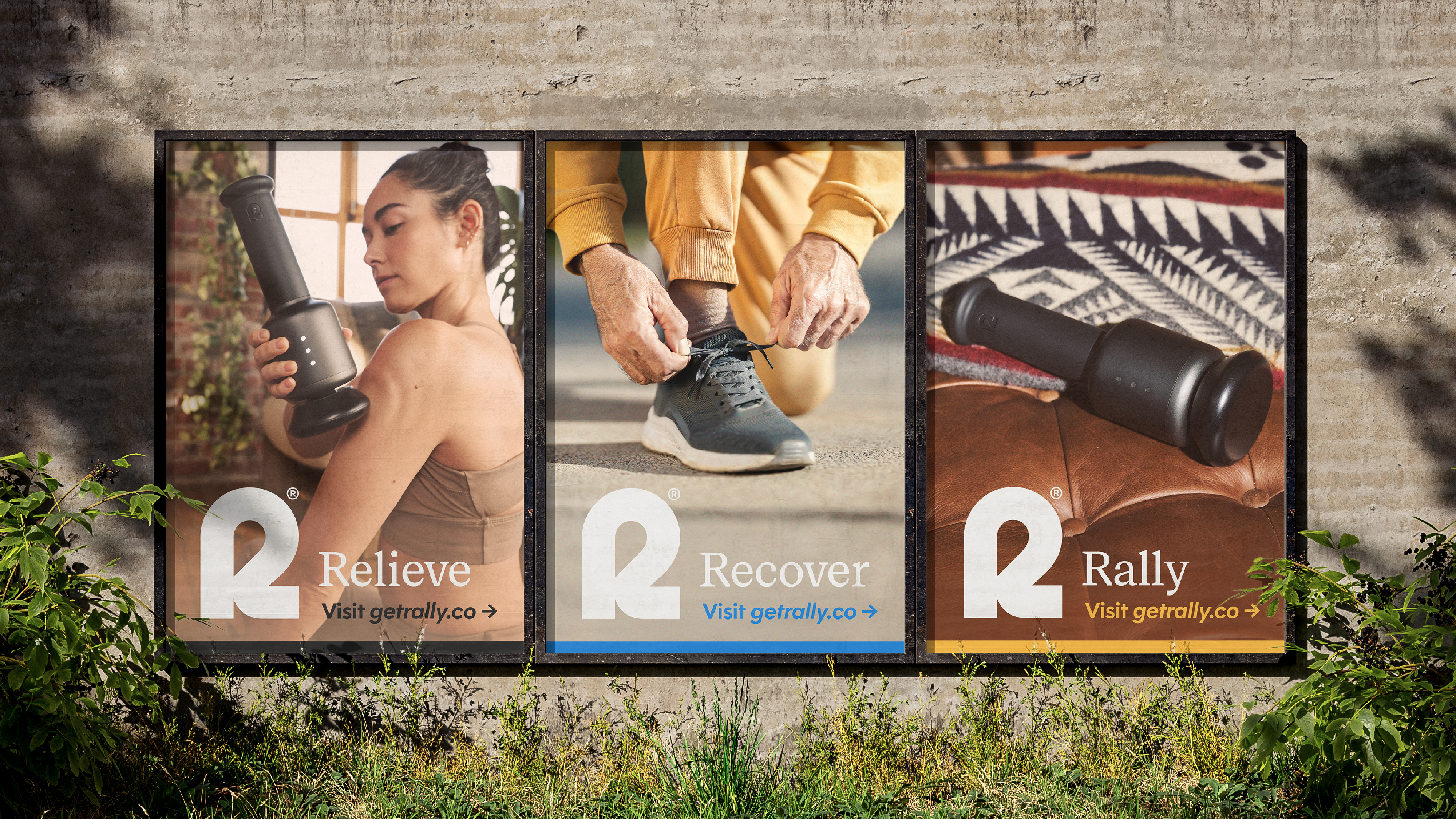
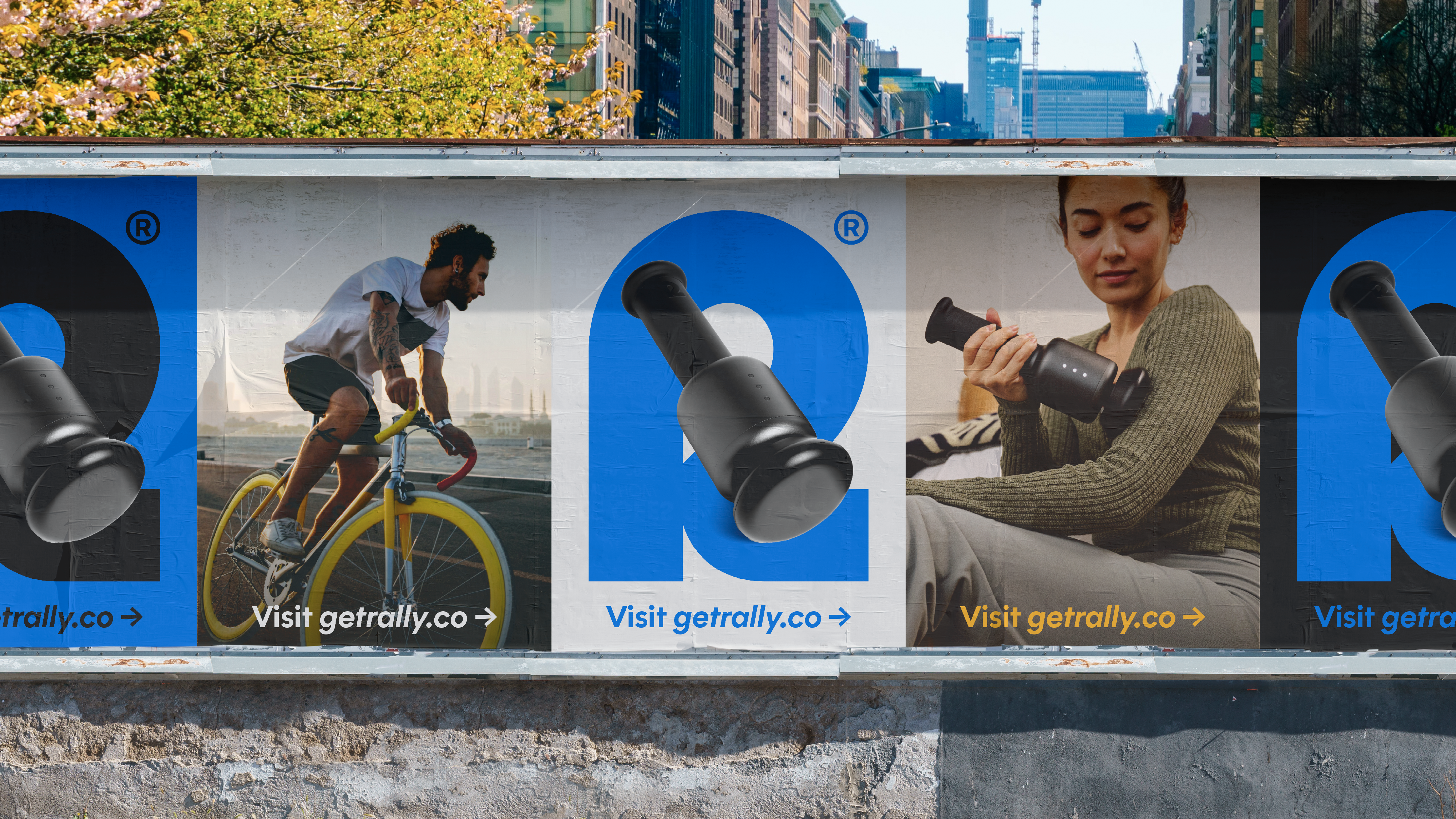
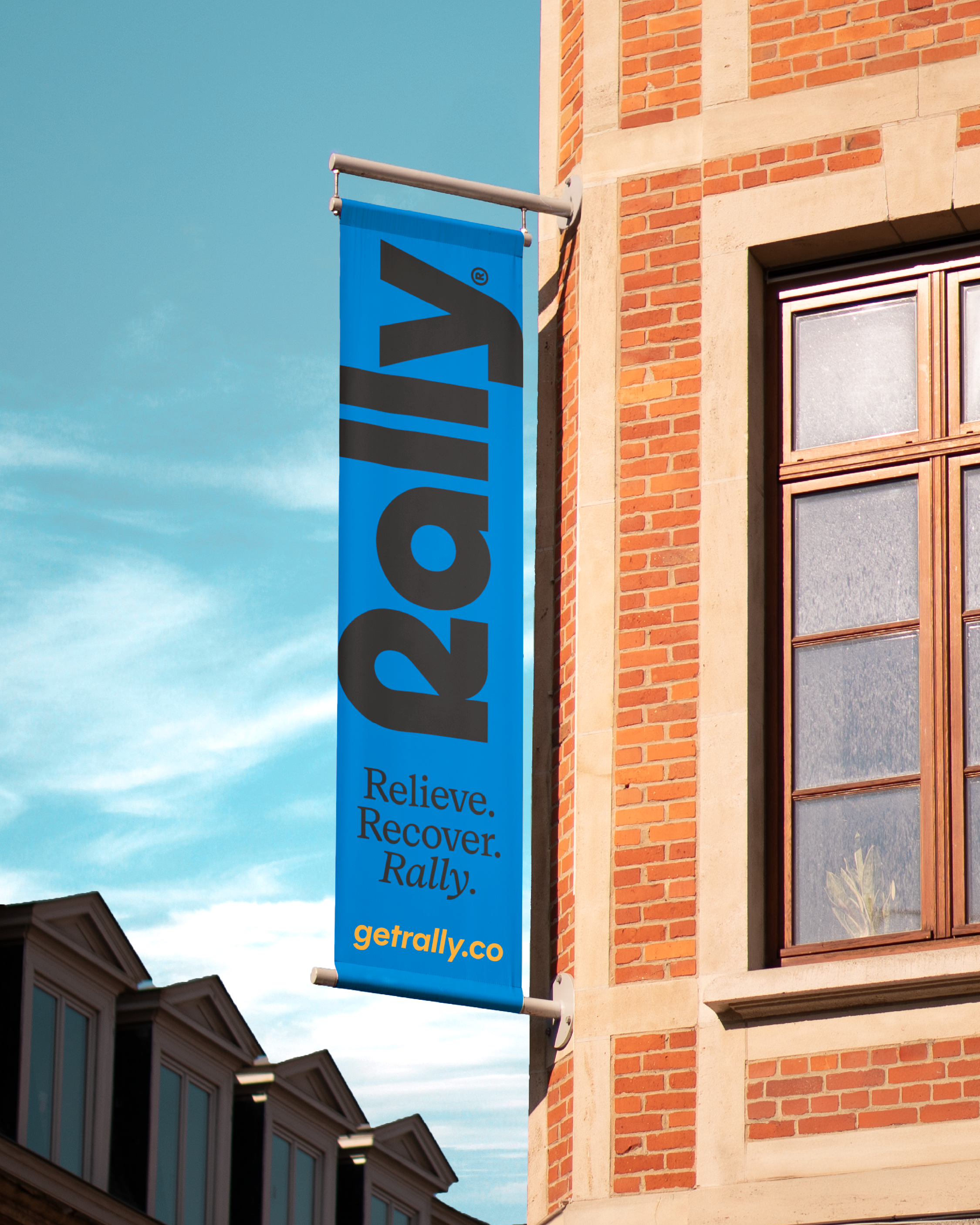
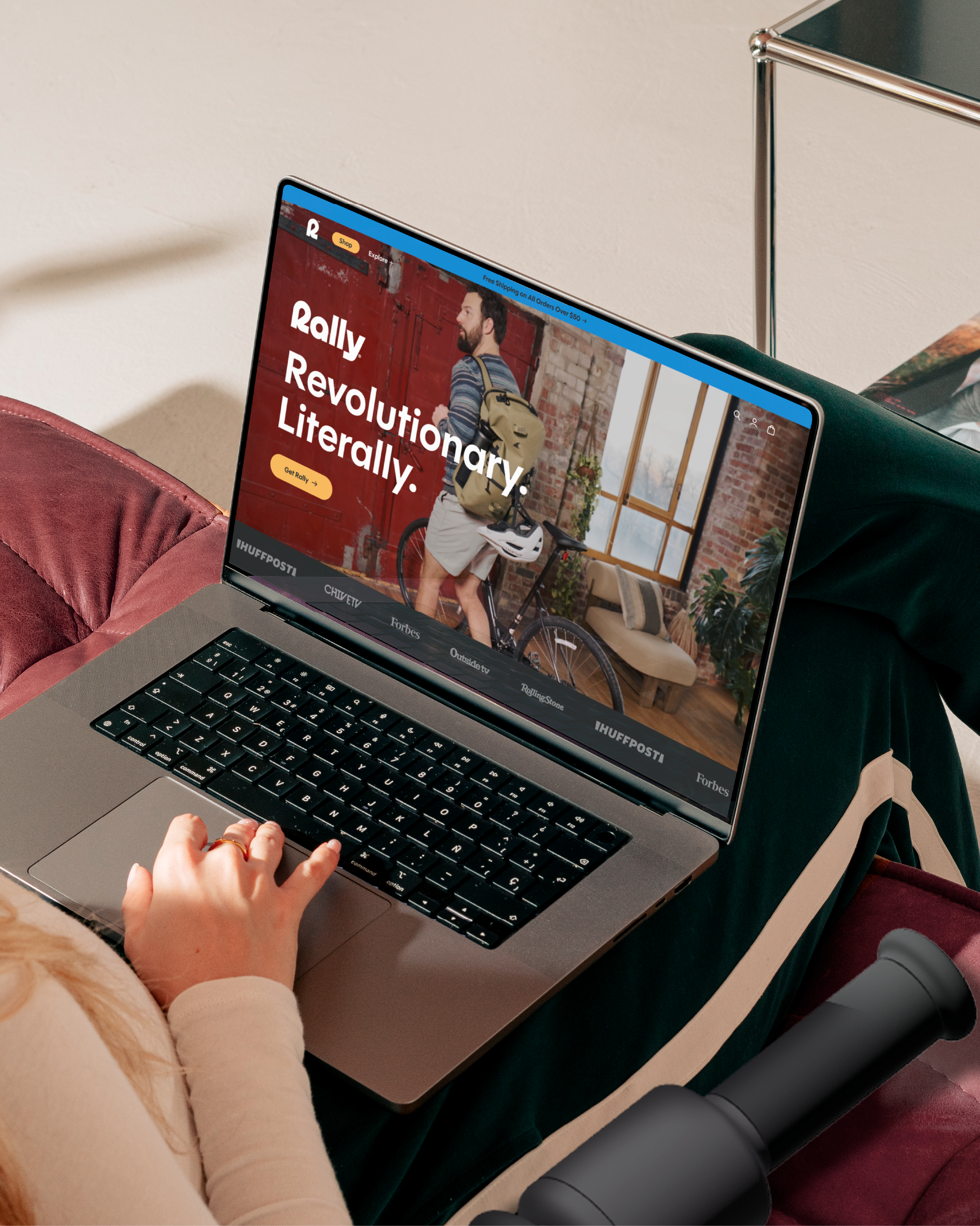
Experience the revolution, adding relief to your routine.
We were tasked with bringing Rally to life in a wellness category that traditionally glorifies intensity – where products are often harsh, percussive, cold and sterile. Rally disrupts the norm. It’s gentler, more intuitive, and designed to extend the feel-good moments rather than impose repercussions. The challenge was to carve out a distinct, ownable space that redefined expectations and resonated with an audience seeking comfort, consistency, and ease in their wellness routine.
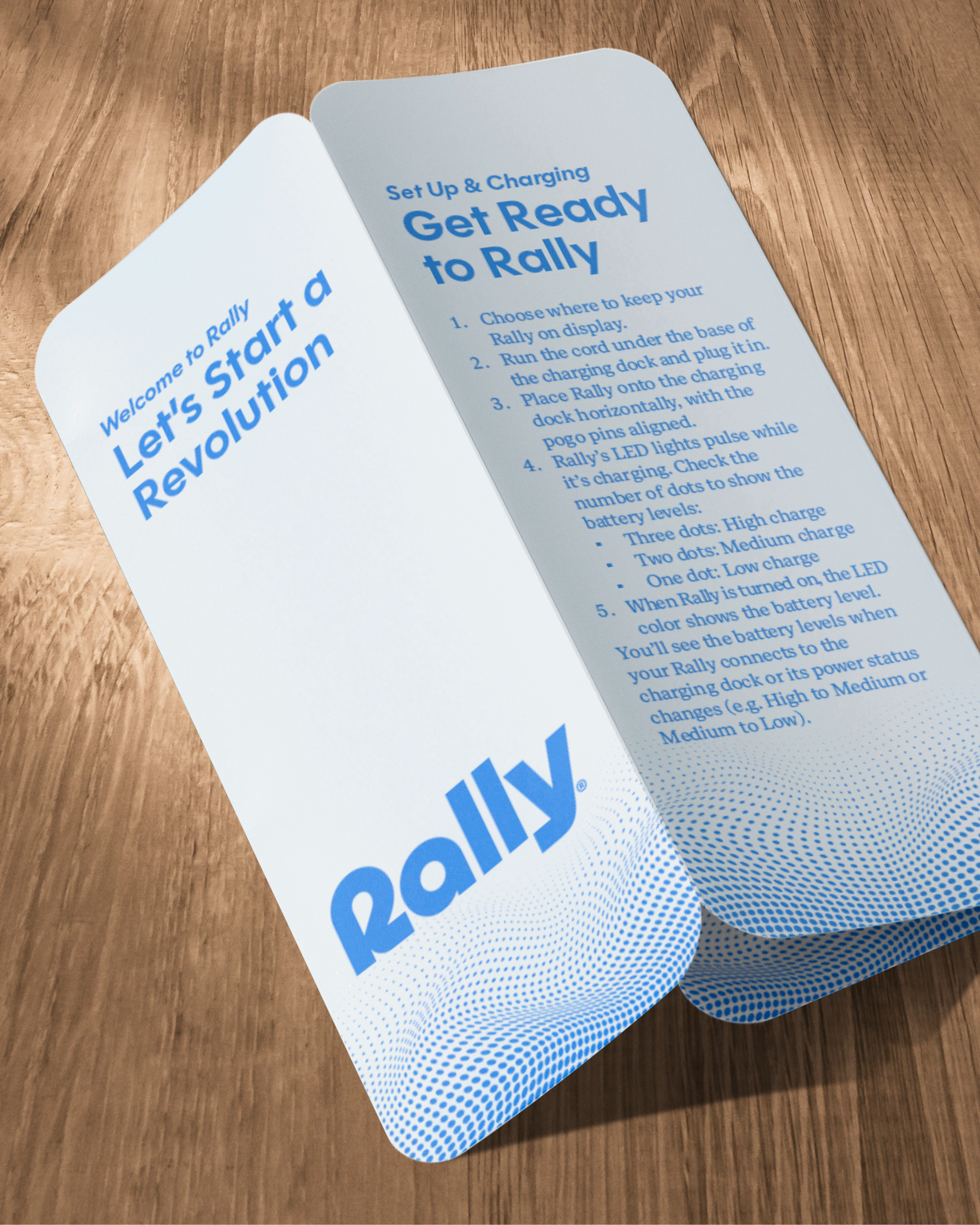
Our design approach embodied Rally’s unique orbital motion which is a departure from the category’s aggressive percussive force. The brand identity subtly reflects this continuous, soothing movement through flowing dot matrices, symbolizing the gentle, rhythmic vibrations and reinforcing the product’s seamless, restorative effect. Rather than emphasizing intensity or occasion-specific use, we positioned Rally as a daily essential – an effortless, positive, and welcoming invitation to self-care. This shift not only set the brand apart but also aligned with the evolving consumer mindset of wellness as a holistic, feel-good ritual rather than a reactive necessity.
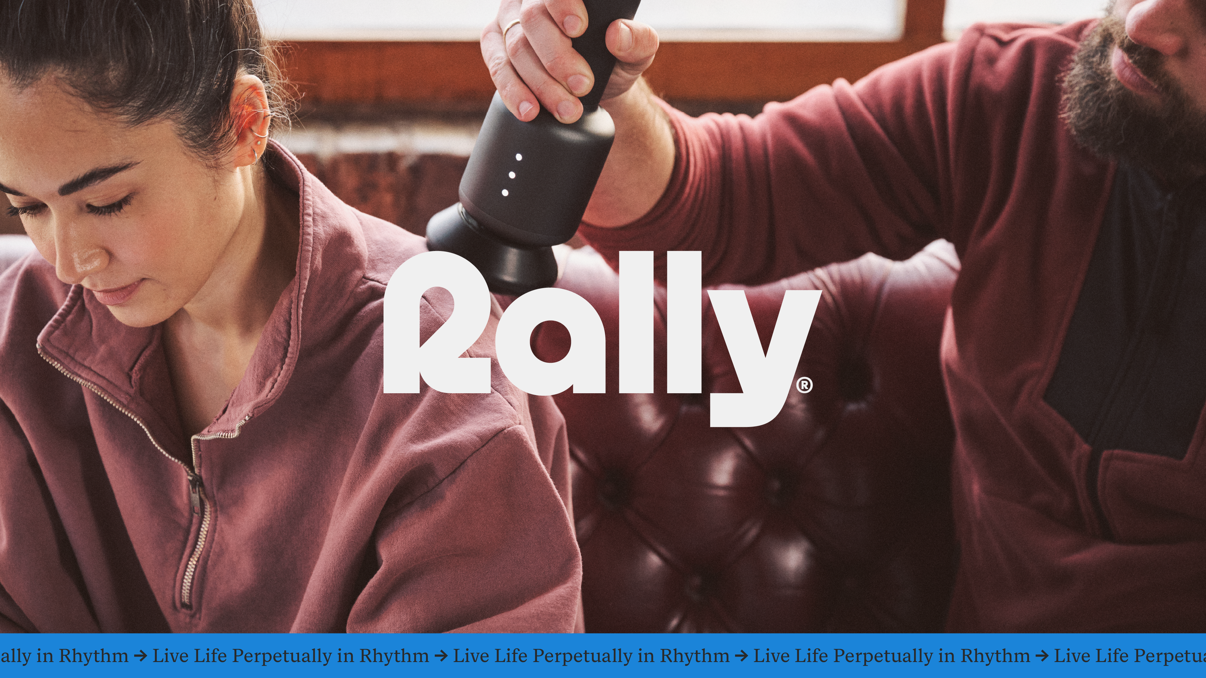
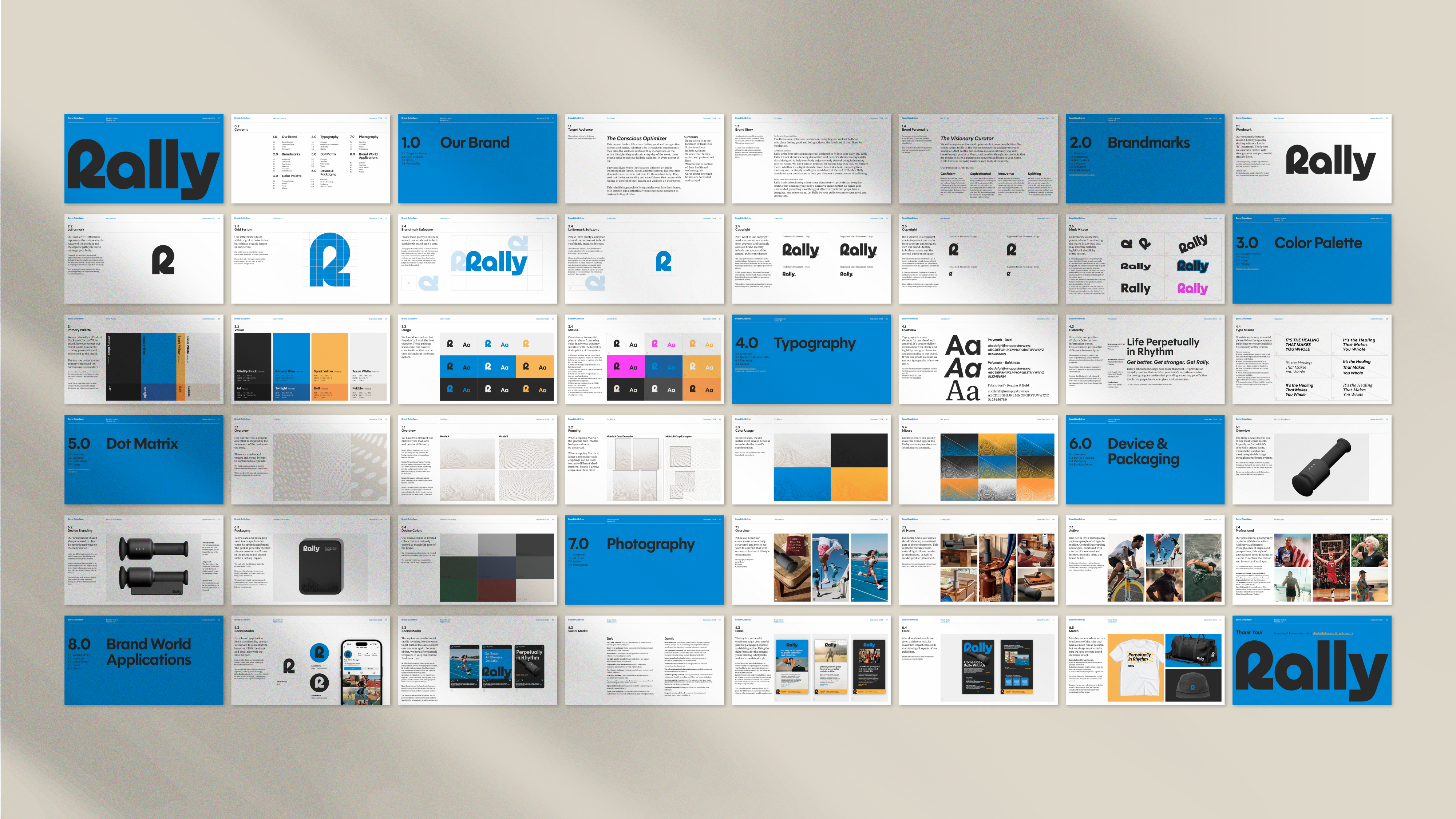
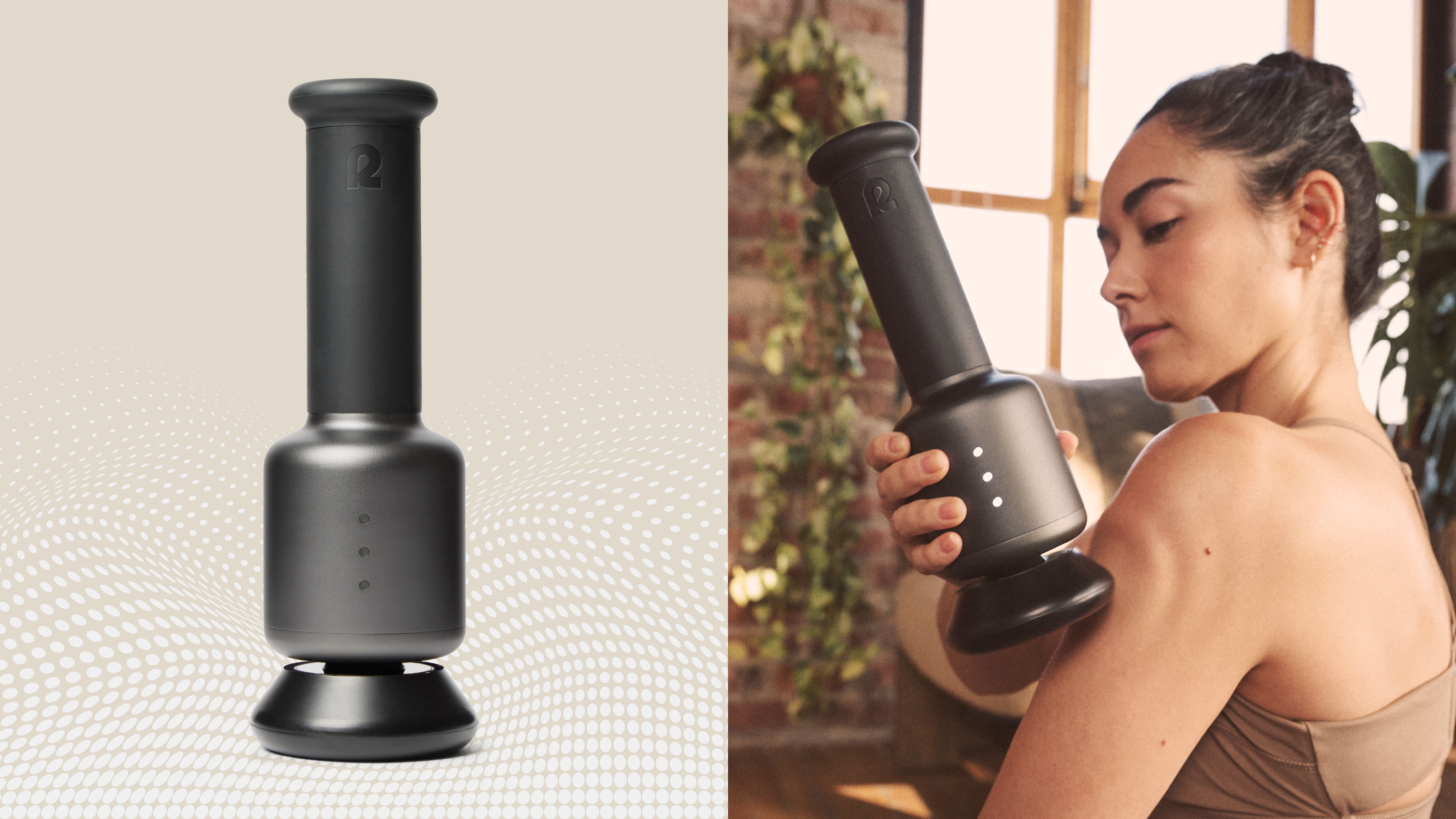
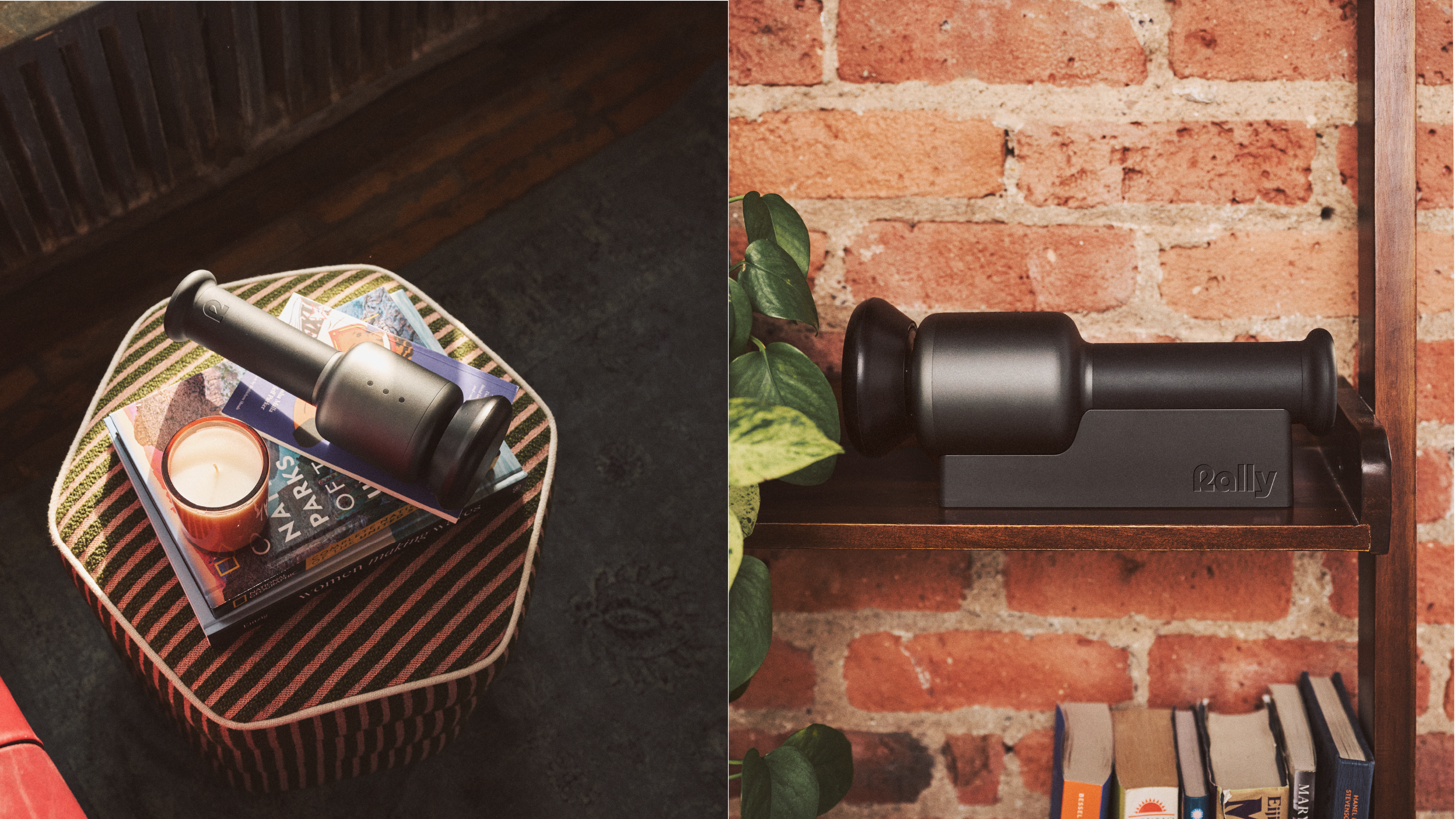
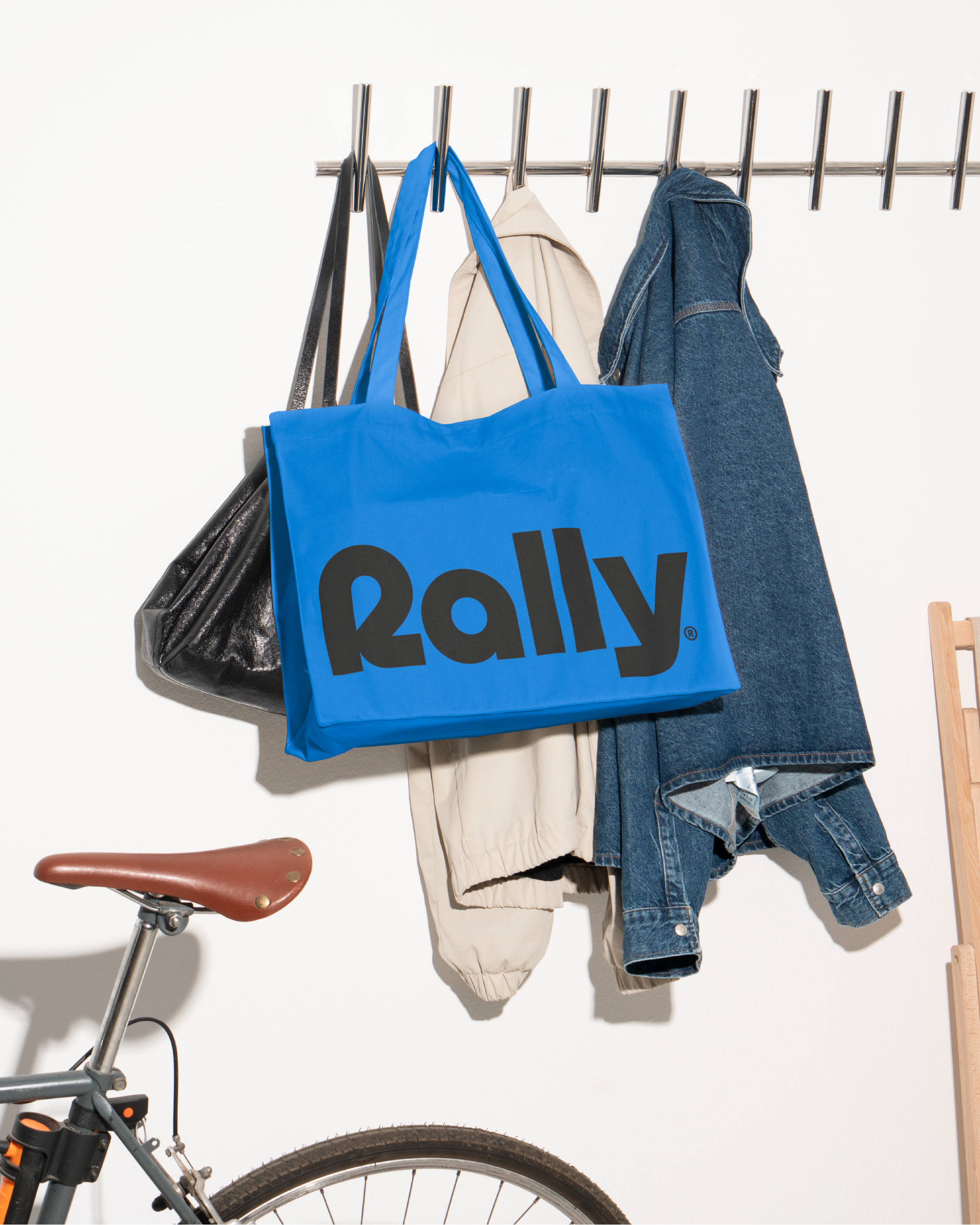
Rally’s elegant design is crafted to seamlessly complement your home, drawing inspiration from classic Scandinavian aesthetics and timeless Japanese minimalism. Interact led the strategy, naming, visual identity, art direction, web design, and tone of voice, and established the brand’s core identity as "Perpetually in Rhythm." This concept became the foundation for a bold and inspiring reimagination of what a modern wellness device can look and feel like.
Rally’s elegant design is crafted to seamlessly complement your home, drawing inspiration from classic Scandinavian aesthetics and timeless Japanese minimalism. Interact led the strategy, naming, visual identity, art direction, web design, and tone of voice, and established the brand’s core identity as "Perpetually in Rhythm." This concept became the foundation for a bold and inspiring reimagination of what a modern wellness device can look and feel like.

Rally’s elegant design is crafted to seamlessly complement your home, drawing inspiration from classic Scandinavian aesthetics and timeless Japanese minimalism. Interact led the strategy, naming, visual identity, art direction, web design, and tone of voice, and established the brand’s core identity as "Perpetually in Rhythm." This concept became the foundation for a bold and inspiring reimagination of what a modern wellness device can look and feel like.