CLIENT
Northern Native Cannabis Co.
Art Direction & Design: Andrew Sondheim
Brand Strategy & Copywriting: Jacki Ognibene
Client: Northern Native Cannabis Co.
Agency: Anthem Branding
PROJECT
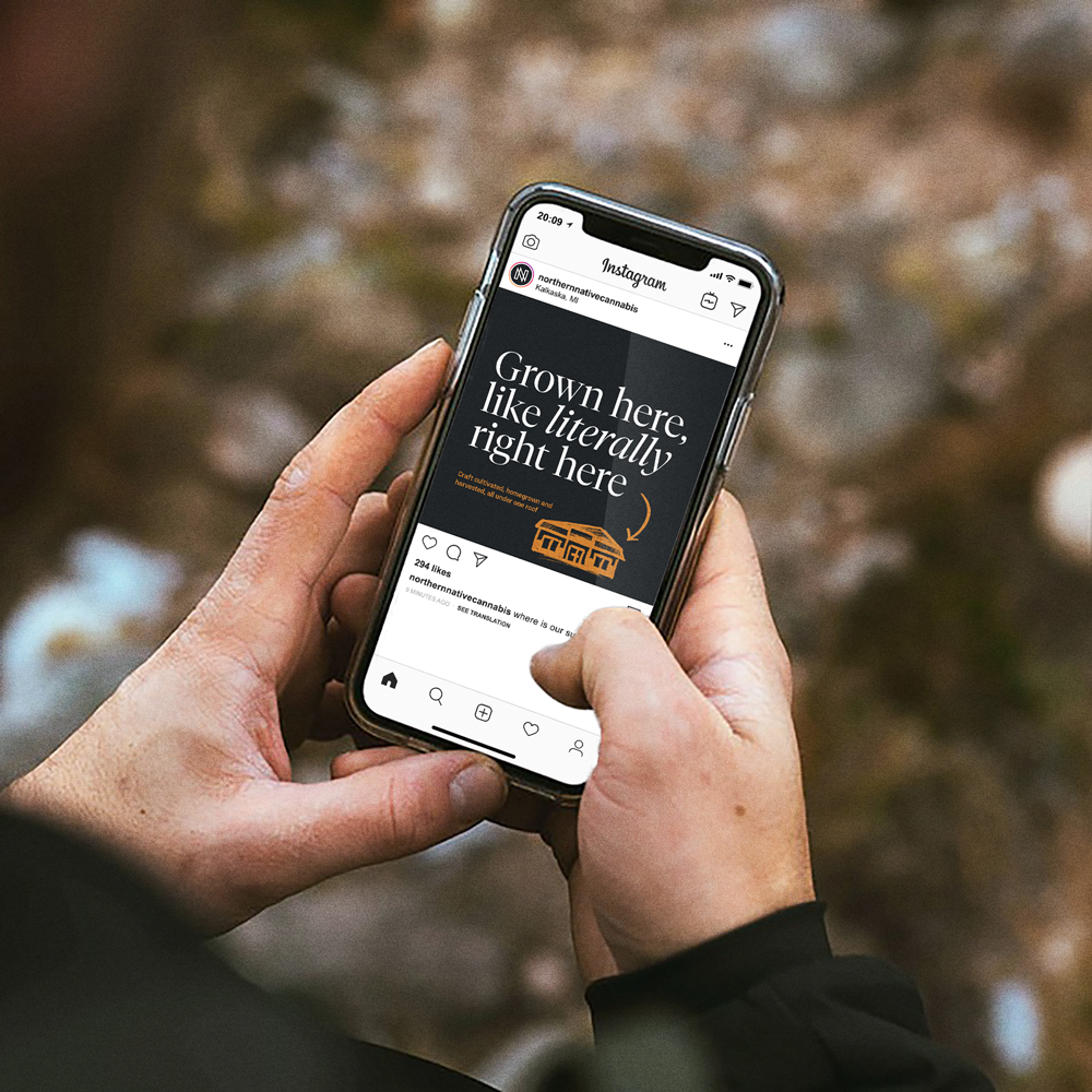
Defining the identity system of a new age dispensary in a growing Michigan landscape.
Emerging as a new thought leader in Michigan’s cannabis scene, Northern Native Cannabis Company will grow, process, and sell recreational marijuana using an innovative micro-dispensary concept.
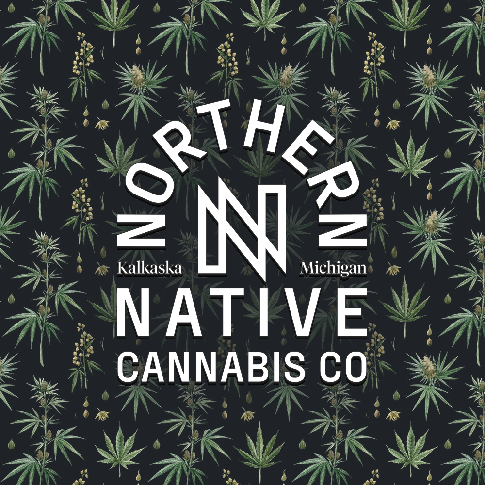
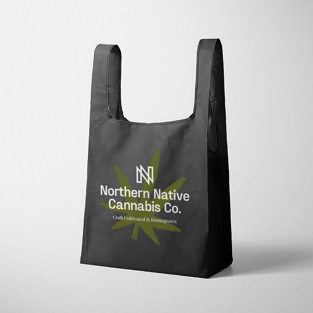
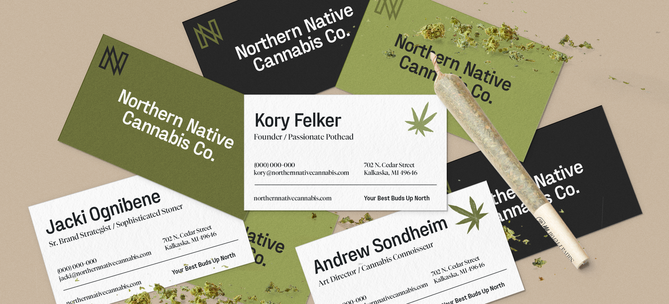
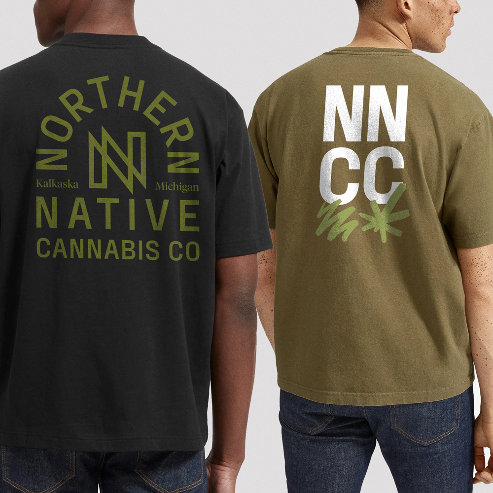
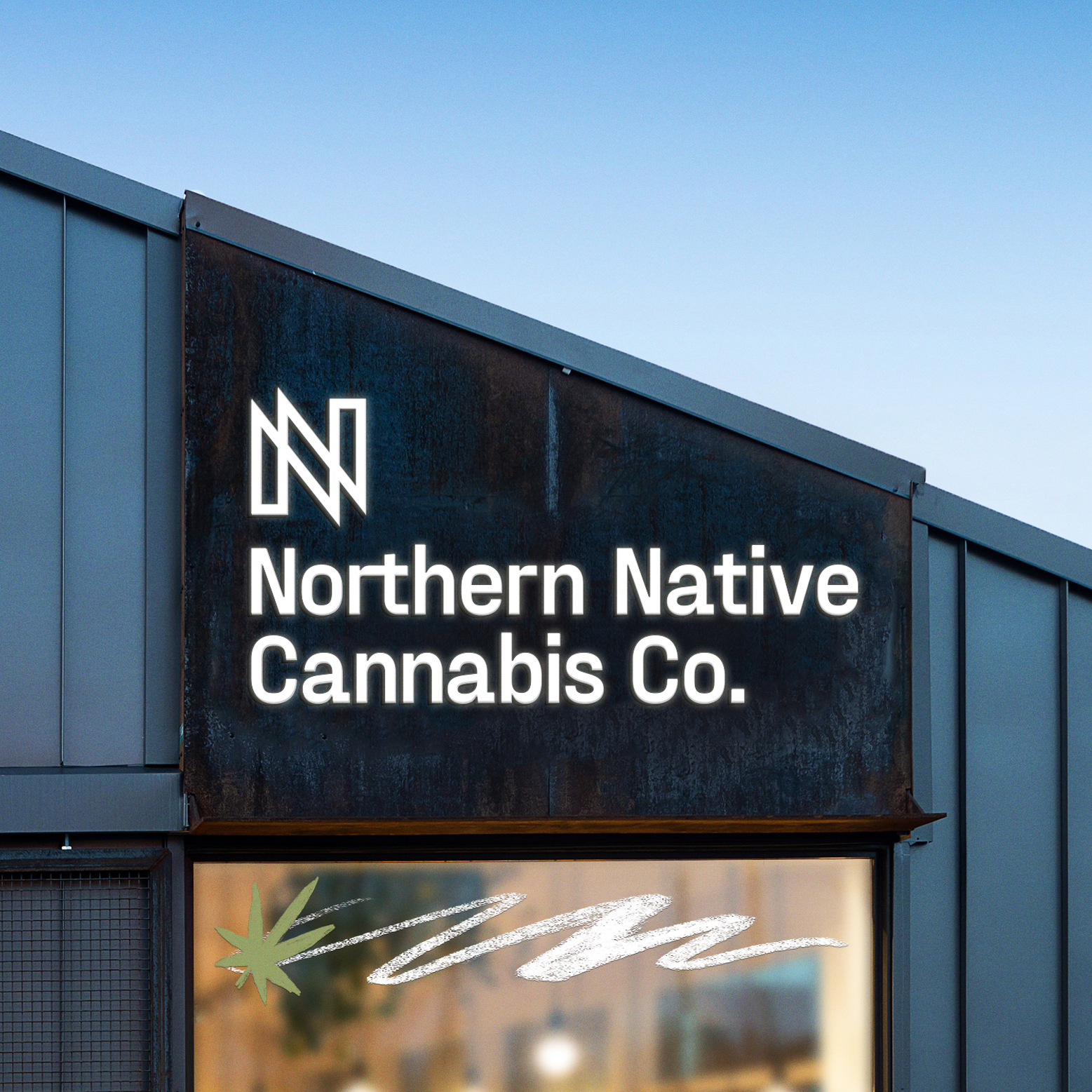
Our task was to refine and expand on the brand's existing monogram logo and develop a brand toolkit including multiple lockups for a variety of uses, color and typography systems.
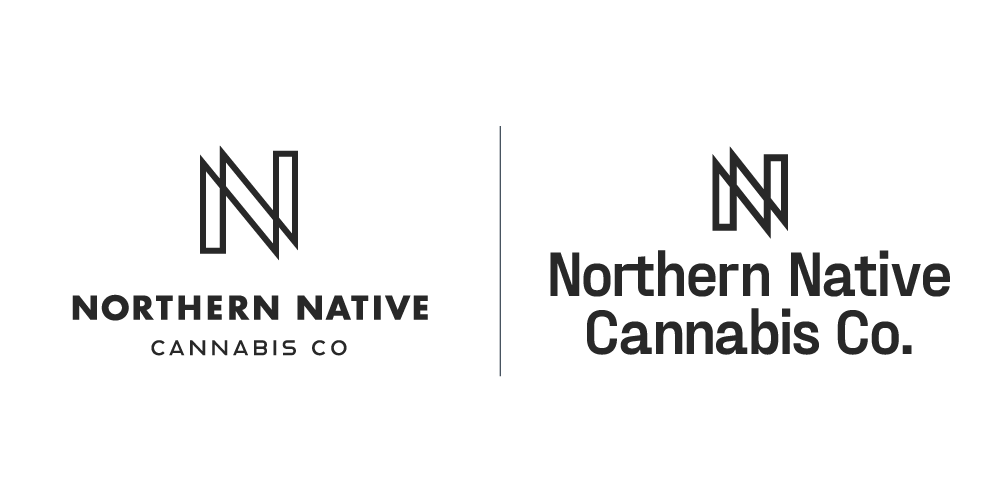
Before / After The previous monogram felt unbalanced, light, and generic. I updated the mark to feel more balanced in size, shape, and line weight. The new wordmark helped the typography feel more unique and modern compared to the traditional sans serif.
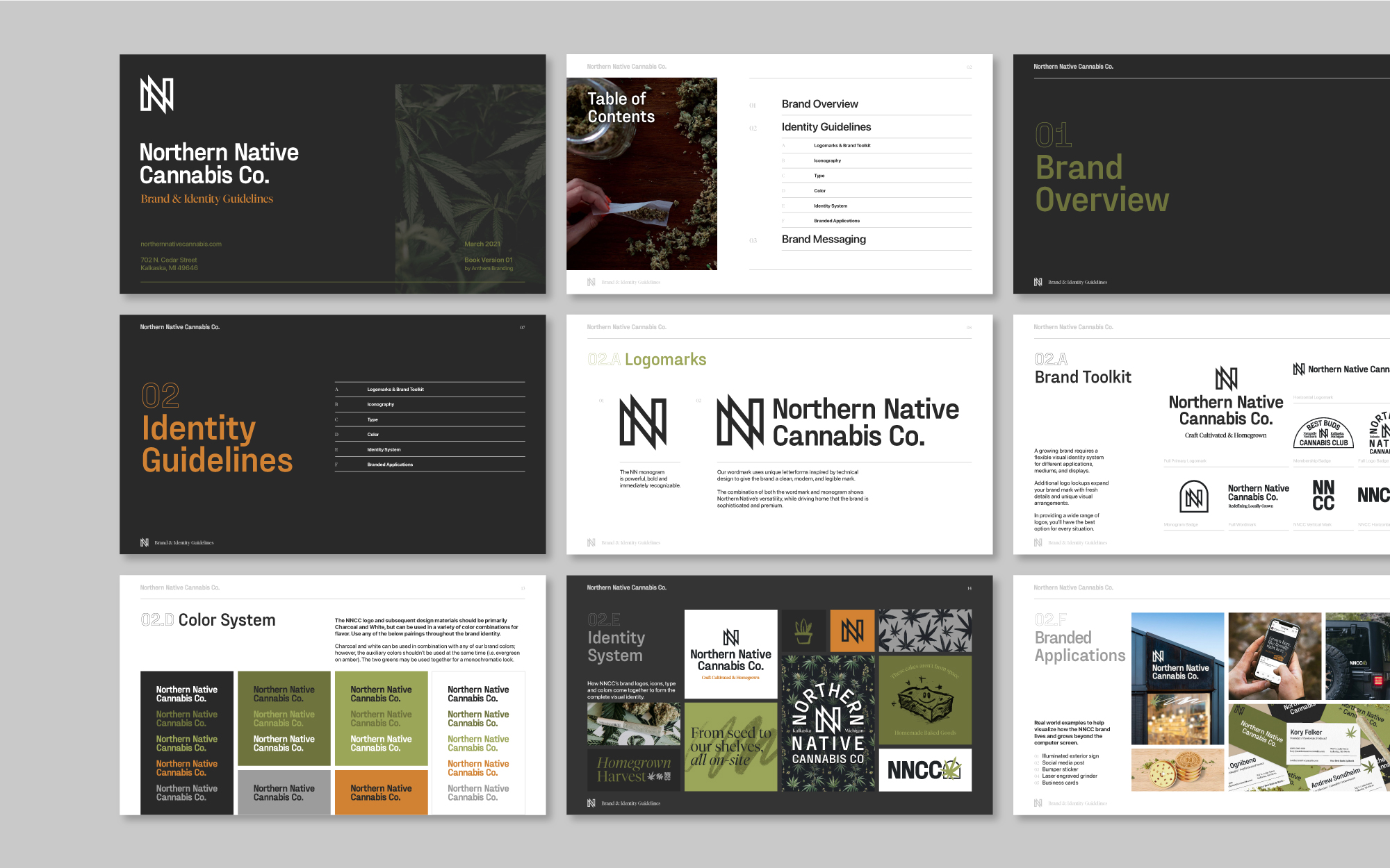
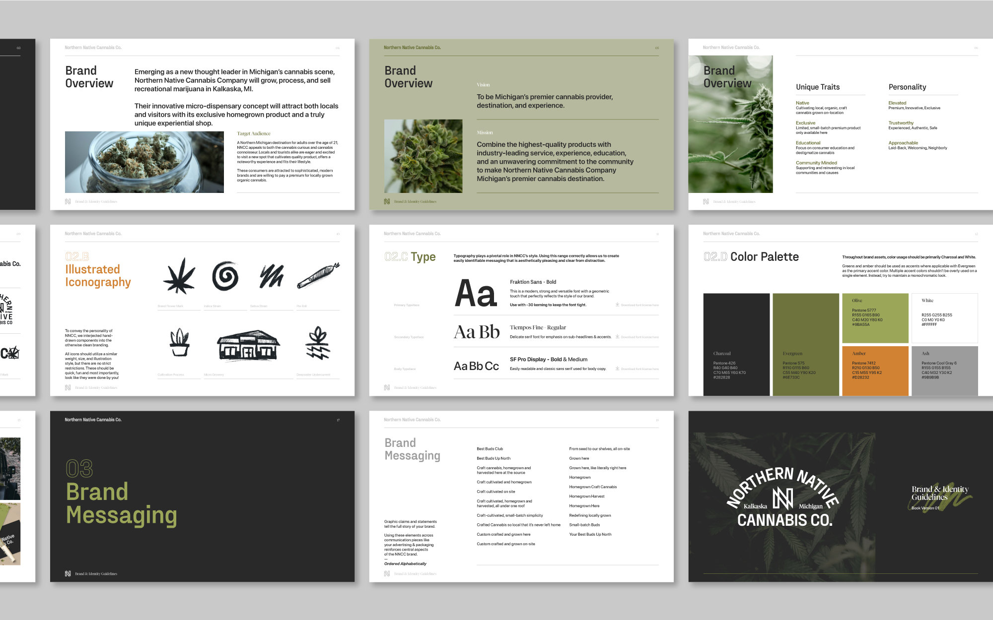
The brand book highlights the different brand facts that evolved from the original NN monogram. The driving aesthetic throughout the identity has been pushing minimal, modern, and accessible design with human elements (i.e. sketched iconography) to drive home NNCC’s homegrown ethos.